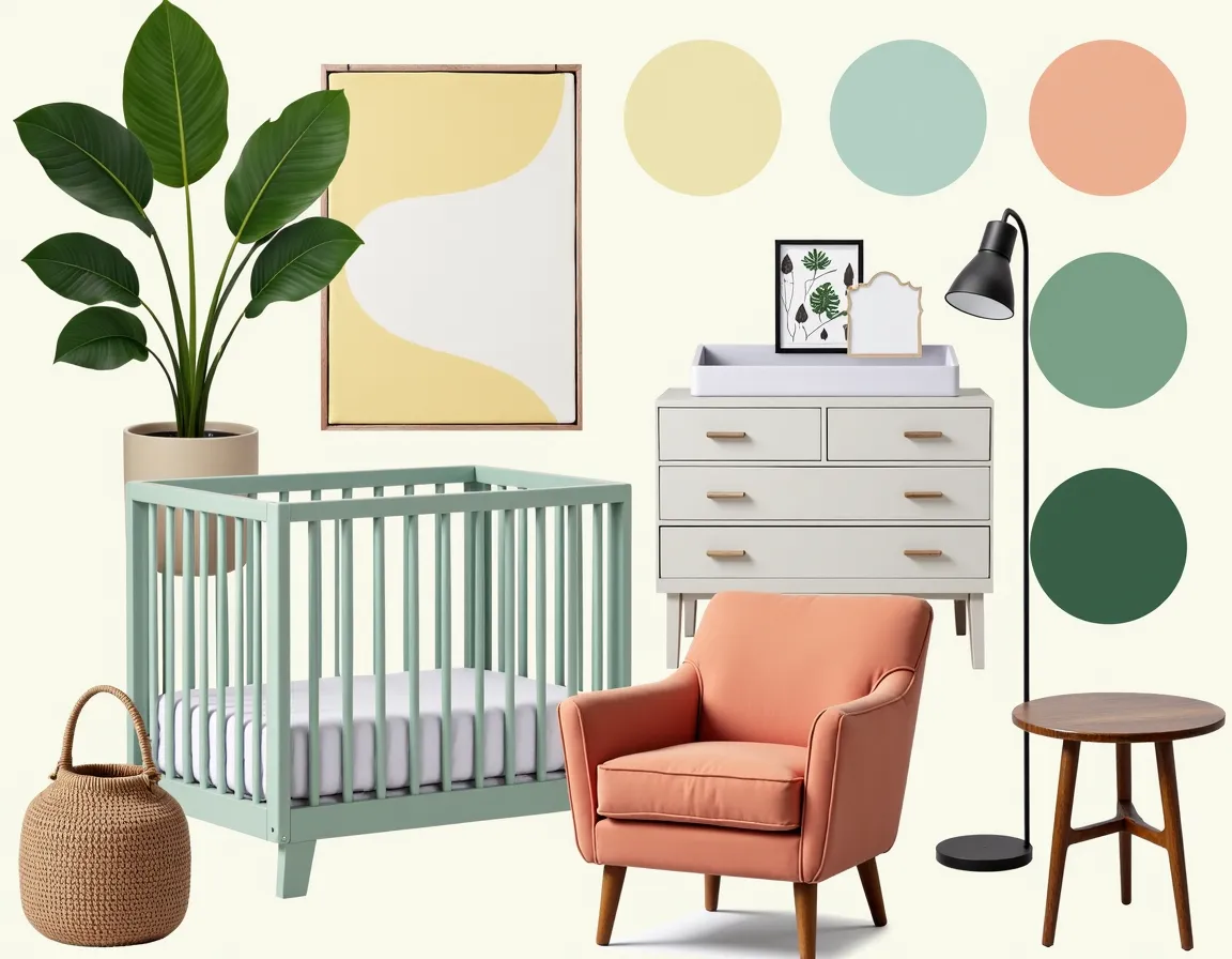
2026 Earth Tone Color Palette for Your Mood Board
There's a moment when a color trend stops feeling like a trend and starts feeling like the right answer. That's where earth tones are in 2026. Not a passing Instagram aesthetic, but a collective exhale: a move toward colors that feel like they've always belonged in a home.
The dominant story this year is what designers are calling earthy vibrancy: rich ochres, olive greens, muddy blues, deep plums, and warm terracotta. These aren't the greige neutrals of a decade ago. They have depth, saturation, and personality. They just happen to feel like they were pulled from the ground rather than a neon sign.
Key Takeaways:
- 2026's earthy vibrancy trend means saturated, nature-derived hues rather than bland neutrals.
- The strongest palette combinations layer a dominant earth tone with organic midtones and one unexpected accent.
- Earth tones pair best with natural textures like linen, wood, stone, and woven materials.
- Moody earth tones work beautifully in small spaces, so you do not need to avoid deeper shades.
- MoodBoardAI lets you test these palettes against real room layouts before you commit.
Why is 2026 going so deep on earth tones?
The answer has as much to do with psychology as aesthetics. After years of fast-moving design cycles, there's a visible pull toward permanence. Warm, nature-derived colors feel stable in a way that trendy jewel tones or stark minimalism do not. They're colors that civilizations have been using for millennia, from terracotta urns to olive-painted shutters in the Mediterranean.
Pantone's 2025 Color of the Year, Mocha Mousse, a warm chocolate brown, seeded this direction. In 2026, that thread continues and deepens. The palette widens from a single mocha tone to a full range of earth-born hues: espresso, cacao, and warm sepia at the dark end; golden ochre and sun-baked terracotta in the middle; dusty olive and sage green offering contrast without brightness.
What makes 2026 different from previous natural trends is that these colors are not timid. A room decorated in earthy vibrancy has presence. The palette is grounded, not muted.
What does earthy vibrancy actually look like?
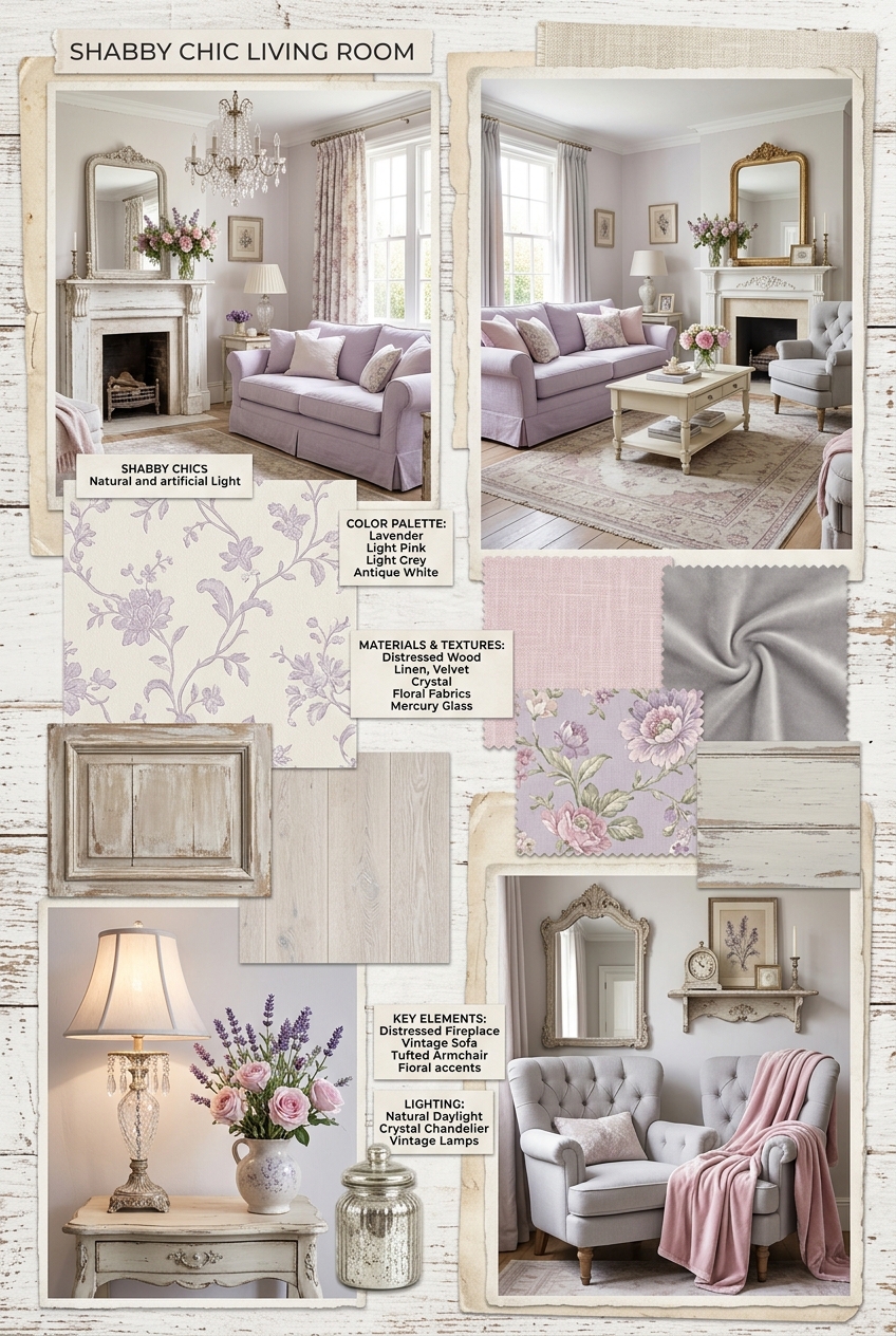
The phrase can sound abstract until you see it in a real room. Think about a living room where the sofa is a deep, matte terracotta, not a bright orange, but something closer to dried clay. The walls read as warm greige with a slight olive cast in natural light. A throw introduces a muddy plum, and the coffee table is raw walnut. The overall effect is rich and grounded, but there is enough color variation that the room feels alive.
That interplay between depth and warmth is the signature of the moment. These are not colors that compete with each other. They come from the same family, literally, since earth, clay, stone, and plant pigments share the same warm-to-cool spectrum. When you build a palette entirely from that family, the room feels cohesive without feeling monochromatic.
The real-room transformations in our gallery make this easier to visualize. A contemporary living room redesigned in rust, terra cotta, and mustard looks nothing like the earth tones of the 1990s. It feels bold and contemporary, just warm. That's the distinction.
The palette combinations designers are actually using
You do not need to reinvent anything here. A handful of palette structures are showing up across design studios, showrooms, and mood boards right now, all variations on the same earthy vibrancy theme.
The Terracotta Anchor: Terracotta as a dominant wall or upholstery color, layered with warm linen, natural wood, and a deep plum or forest green as an accent. This is probably the most versatile 2026 combination, and it works in a living room, bedroom, or kitchen.
The Olive-Led Room: Start with olive green as your primary color, whether as wall paint or a large sectional, and build from there with tobacco brown, warm cream, and occasional pops of dusty rose. Olive reads sophisticated and natural at the same time.
The Dark Earth: For those willing to go deeper, the espresso-and-sage combination is getting attention. Use a very deep brown for one feature element, balance it with sage green or grey-green, and let natural materials like rattan and undyed linen do the lightening work.
The Earthy Neutral: If you like the direction but want to stay cautious, start with a warm greige base and introduce earth tones through accessories like terracotta cushions, an ochre rug, or a plum throw.
How to build your mood board around earth tones
The classic mistake with earth tones is treating them like a formula. The colors work, but without intentional curation, the room can feel like a Pinterest board assembled from different directions instead of a single coherent vision.
Start with your anchor material, not your wall color. Pick the most expensive or immovable element first, usually a sofa, a rug, or your existing flooring. If your hardwood floors are golden oak, your palette should lean into warm earth tones like ochre, amber, and warm greige rather than fight with a cool grey-green scheme.
Once you have your anchor, the rest of the palette almost builds itself. Choose a midtone that harmonizes, usually another earth tone a few shades lighter or more muted, a lighter neutral for walls or large textiles, and one accent that creates just enough contrast, often a plant-inspired green or a deeper jewel-adjacent plum.
In MoodBoardAI, you can drop in your anchor color and experiment with palette combinations in real time. It's the fastest way to see whether that terracotta sofa actually looks right against a dusty sage wall before you commit to paint.
The role of texture and why earth tones need it
Here is the thing most palette guides skip: earth tones come alive through texture, not contrast. A terracotta wall next to a flat white sofa is boring. A terracotta wall next to a chunky linen sofa, a raw walnut shelf, and a woven grass rug is interesting, even though the palette is almost identical.
This is because earth tones are pigment-rich colors that absorb and reflect light differently depending on surface texture. A matte painted wall in the same rust hue as a glossy ceramic vase can read like two entirely different colors. Leverage that. Mix surfaces like matte paint, rough-weave textiles, polished wood, stone, and ceramics, and the palette gains depth that no amount of extra color variety can create on its own.
The materials that work best with 2026 earth tones are natural linen, undyed wool, raw or oiled wood, rattan and wicker, unglazed terracotta ceramics, rough plaster, and stone. Most of these are accessible at many price points.
Common mistakes when working with this palette
The most frequent error is adding too much warmth without relief. A room full of terracotta, brown, and ochre without any cooler counterpoint can feel oppressive. The muddy blue and olive green parts of the 2026 palette serve exactly this purpose. They are still earthy and nature-derived, but they provide enough coolness to let the room breathe.
Another trap is ignoring light. Earth tones behave radically differently across the day. An ochre that looks warm and golden in morning sun can look muddy in the afternoon. A deep olive that reads sophisticated under natural light can look flat under artificial lighting. Test samples at multiple times of day, and build your board using real room examples rather than isolated swatches.
Finally, do not layer everything at once. Start with the anchor, live with it for a week, then add the next element. Earth tones are forgiving and tend to layer naturally, but even a harmonious palette becomes overwhelming when applied to every surface at the same time.
Making it your own in 2026
The best thing about this design moment is that earthy vibrancy is not prescriptive. The palette is broad enough that a terracotta-and-sage Scandinavian-inspired room and a deep espresso-and-plum moody library can both feel like authentic expressions of the same trend. What they share is intentionality, the sense that every color choice was considered.
Building a mood board first is how you find your specific version of the trend. Gather your anchor pieces, palette swatches, material samples, and room examples. Notice what pulls toward warm ochre versus cool olive. Pay attention to which direction feels like you rather than just what everyone else is doing.
Then bring it into MoodBoardAI, test it against actual room layouts, and adjust until it clicks. That's the 2026 approach to decorating: color-confident, texture-led, and grounded in what actually looks good in the real spaces you live in.
Frequently asked questions
What are the trending earth tone colors for 2026?
The dominant 2026 earth tones include rich ochre, olive green, muddy blue, deep plum, terracotta, and warm espresso brown. Designers call this earthy vibrancy because the colors feel grounded and natural while still having enough saturation to feel bold.
How do I build a mood board around earth tones?
Start with one dominant earth tone as your anchor, usually a wall color or a large furniture piece. Then layer in a midtone, a lighter neutral, and one contrasting accent. A reliable 2026 combination is terracotta anchor, olive midtone, warm linen neutral, and plum accent.
Do earth tones work in small rooms?
Yes, often better than pale neutrals, which can read as cold. Deep tones like espresso or plum can make a small room feel cozy and intentional. In low-light rooms, favor mid-range earth tones like golden ochre or warm terracotta instead of the darkest shades.
What's the difference between earth tones and neutral colors?
Neutrals are usually pale and desaturated, such as cream, greige, and light grey. Earth tones have visible pigment and warmth, including rust, olive, tobacco brown, and terracotta.
How do I combine earth tones without making a room feel heavy?
Use your richest tone sparingly, balance it with lighter midtones, and bring in natural materials like linen, wood, and rattan to keep the palette textured rather than dense. Warm artificial lighting also helps deeper earth tones feel lifted rather than flat.