Sage Green Color Palette: What Actually Works (and What Doesn't)

The sage green color palette question seems simple — "what goes with sage green?" — but most people asking it are actually trying to answer a much harder one: "will this work in my specific room, with my specific furniture, at six PM in winter light?" That is not a paint chip question. That is a mood board question. And the reason sage green often disappoints people is that they tested the color in isolation rather than as part of a full palette system.
Sage is one of the most adaptable tones in contemporary interior design, but it is not as forgiving as it looks. The undertone makes an enormous difference. The room's light changes how it reads. The materials around it determine whether it feels grounded or flat. We have tested hundreds of sage green combinations through MoodBoardAI's AI generator and the mood board editor, and the ones that work all have something in common: the palette was built around the sage, not just alongside it.
Key Takeaways
- Sage green's undertone — warm grey-green vs. cool blue-green — determines every other color decision in the palette.
- Cream, warm white, oak, and linen are the most reliable partners because they support sage without competing.
- Sage works across multiple styles — modern, Japandi, bohemian, coastal — because it behaves almost like a neutral when used correctly.
- Accent choices determine the mood: warm terracotta and amber push the room toward organic; dusty blue and stone push it toward cooler calm.
- Test the full palette in a room context using MoodBoardAI's AI generator before committing to paint, upholstery, or large purchases.
Why Does Sage Green Feel Different in Every Room?
Sage green is not a single color. It is a family of grey-greens with varying undertones — some lean warm with yellow or earthy olive notes, others lean cool with blue or grey-lilac behind the green. That difference is subtle in a swatch and dramatic in a room. A warm sage on a south-facing wall in good afternoon light feels earthy, grounded, and almost caramel-adjacent. The same color on a north-facing wall in flat winter light can read flat, tired, or slightly murky.
The most common sage green frustration comes from choosing a paint chip without testing what happens when it lives next to the warm wood, the existing sofa fabric, and the natural light conditions of the actual room. This is where a full mood board pays off immediately. When you collect your sage reference alongside the floor tone, the sofa color, the curtain fabric, and the wood furniture finish, the palette reveals whether the sage is supporting everything or fighting it. That comparison is faster and less expensive than painting a room and living with the mistake.
For a broader understanding of how undertone affects every palette decision in a room, interior design color palette guide is worth reading first, because it explains the undertone principle that applies across sage green, warm whites, and every neutral in between.
What Are the Best Colors to Pair with Sage Green?
Cream and warm white are the safest partners because they add brightness without pulling the palette cold. A cream that leans yellow or warm ivory sits beside sage without creating contrast tension. A stark white beside sage green, particularly a cooler sage, can make both colors look harsher than they should. The softer the white, the more forgiving the pairing.
Natural oak and light walnut are the wood tones that work most reliably because they carry a warm honeyed quality that sage green supports naturally. Heavily stained dark walnut or very grey-washed oak can push a sage palette toward cold. The wood tone is often more decisive than the second color, because wood covers more surface area in a room and has a stronger relationship with the walls and upholstery than most accent colors do.
For warmth and personality, dusty terracotta, amber, and dried rust are the strongest accent partners. They sit opposite sage on the color wheel in emotional terms — sage is cool and botanical, terracotta is warm and earthy — and that opposition creates balance rather than competition when the proportions are right. If you want a calmer, more tonal pairing, dusty blush, stone grey, and sandy taupe all coexist comfortably with sage without demanding attention. The right choice depends on whether the room needs energy or quiet, which is something the full board makes obvious fast.
How Does Sage Green Work Across Different Interior Styles?
One of sage green's practical advantages is that it is genuinely style-agnostic. It works in a Japandi-leaning room because it has the organic botanical quality that supports natural materials and warm restraint. It works in a bohemian interior because it sits comfortably in earth tone palettes and pairs well with terracotta, rattan, and handwoven textiles. It works in a coastal interior because it has enough grey in it to feel airy without becoming sharp. And it works in a modern or contemporary space because its grey-green quality reads as sophisticated rather than rustic.
The style determines which version of sage you should use and which partners you choose. In a Japandi room — which the japandi mood board explains in detail — a cooler, more restrained sage sits beside pale ash wood and linen without adding visual noise. In a boho room, a warmer, dustier sage works better beside macramé, kilim, and terracotta. In a coastal room, a softer sage that leans toward seafoam in direct light pairs with bleached wood, white plaster, and pale blue. None of these sages are the same color, but they all fall under the "sage green" umbrella, which is why the undertone question comes first.
If you are building a spring palette with sage as the lead color and want to see how it interacts with seasonal accents like coral and butter yellow, spring 2026 mood board color palette is the specific guide for that direction and already tested those combinations in full room contexts.
| Interior Style | Best Sage Variation | Ideal Partners | Mood |
|---|---|---|---|
| Japandi | Cool, restrained grey-green | Pale ash wood, linen, stone | Quiet discipline |
| Bohemian | Warm, dusty sage | Terracotta, rattan, kilim, macramé | Organic and layered |
| Coastal | Softer sage leaning seafoam | Bleached wood, white plaster, pale blue | Airy and relaxed |
| Modern / Contemporary | Grey-green with clean edges | Cream, warm metals, dark accents | Sophisticated and grounded |

Which Room Benefits Most from a Sage Green Palette?
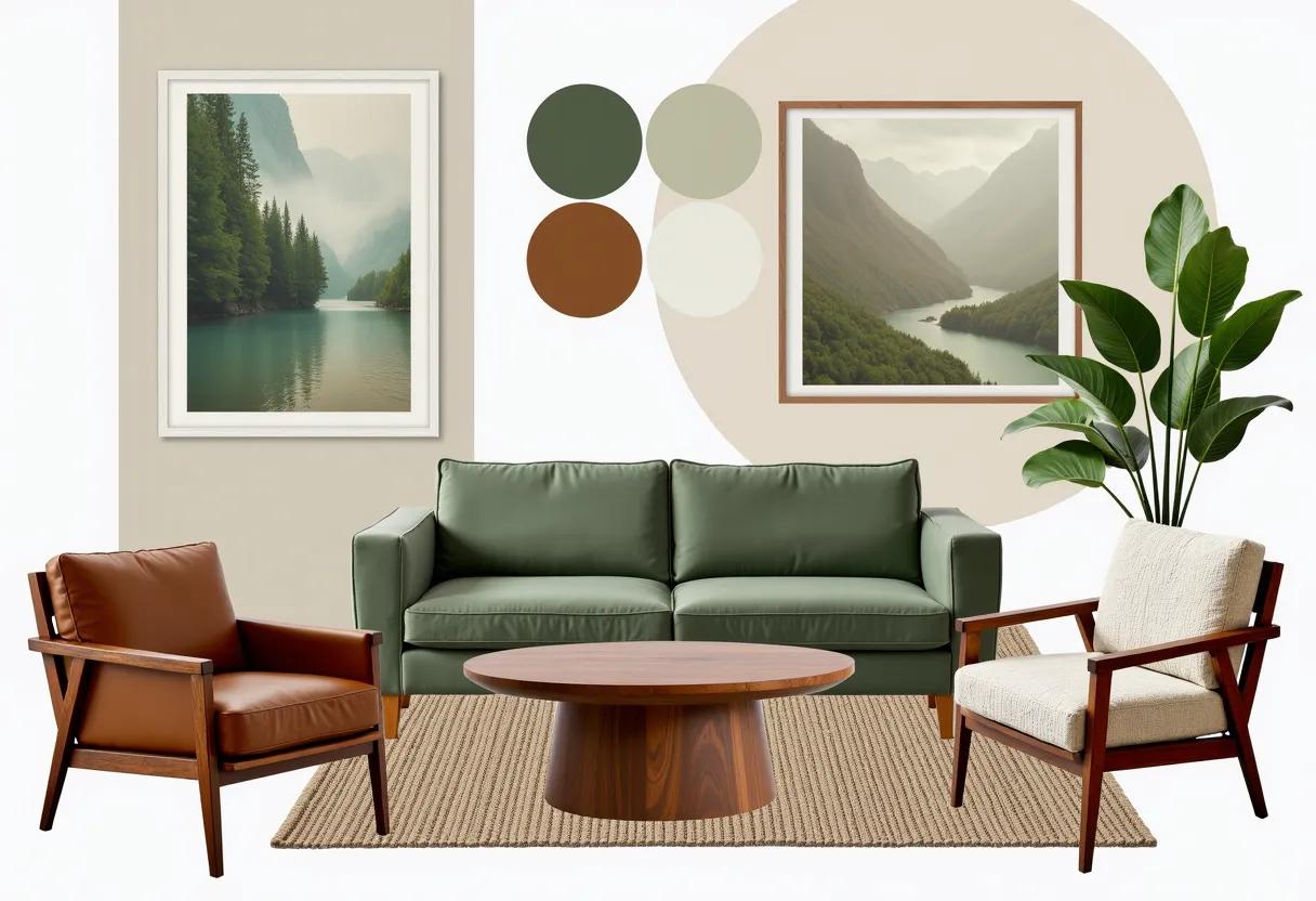
Living rooms are the strongest case because sage green functions like a neutral at the room-wide scale — it grounds the space without the blankness of white, without the warmth of beige, and without the commitment of darker feature colors. On a full living room wall behind a cream sofa, sage green pulls the room together faster than most single color decisions can. It also means the rest of the palette — the rug, cushions, curtains, wood, and art — can be warmer and more varied without the room looking overdone.
Bedrooms are equally strong. Sage green on bedroom walls creates a specific calm that cooler greys and warm beiges do not quite replicate. It is restful without being clinical, and botanical enough to feel connected to the outdoors in a way that supports good sleep environments. The guides in bedroom mood board ideas include several colour-led planning approaches that work well alongside a sage green direction.
Kitchens are the trickier application, but when it works it is one of the most satisfying color choices in home design. A sage kitchen depends heavily on the cabinet material and the light source. A matte sage cabinet in a kitchen with natural light and warm wood shelving can feel like a garden room. The same cabinet in a badly lit galley kitchen without natural materials can look institutional. The board has to account for all of those variables together.

What Should You Avoid When Building a Sage Green Palette?
The first mistake is pairing sage with other mid-tone colours without enough contrast. Sage green and dusty mauve, sage green and soft terracotta, sage green and muted blue — all of those can work, but they need either a strong neutral base or a clear contrast to keep the room from going muddy. When several mid-tones share the same visual weight, no single element has enough authority to lead the room.
The second mistake is choosing a sage that reads differently in the room's specific light and then insisting the board should fix it. If the colour on the wall is wrong for the light, the board cannot compensate with clever accessory choices. Undertone should be tested in the actual space before anything else is purchased. That is the only reliable test.
The third mistake is using sage as an accent when the room needs it as a ground. A few sage cushions in a room dominated by warm beige and honey wood will almost always look arbitrary. Sage works best when it covers enough surface area to actually influence the room's mood — a full wall, a sofa, a large rug, a dominant textile. The difference between sage as a note and sage as a ground is what separates a sage green room from a room that happens to have some sage in it.

How Do You Test a Sage Green Palette Before Committing?
The standard advice is to buy a large paint sample and test it on the wall at different times of day. That is good advice but it only answers the wall question. The bigger question — how does sage work as part of the full palette that includes the sofa, the floor, the wood, the curtains, and the daylight — requires the whole board to be present at once.
With MoodBoardAI's AI generator, you can create several sage green room directions in seconds and compare how different supporting palettes — cream and oak versus dusty terracotta versus stone grey — change the atmosphere of the same green. Once the direction is clear, the mood board editor lets you build the full palette with specific materials, products, and references locked in so you are making sourcing decisions from a complete picture rather than a sequence of individual guesses.
If you want to see sage green in the context of the broader 2026 palette trends rather than in isolation, interior color palette trends 2026 places it alongside other leading tones and makes the comparison between sage, earthy neutrals, and moody darks visible in a way that helps you confirm whether a sage green direction is genuinely right for the atmosphere you are after.

Which Sage Green Palette Works Best for Your Room?
For a calm, nature-forward living room: sage on walls or a dominant upholstered piece, cream or warm ivory as the main neutral, pale oak or light walnut as the wood tone, linen and cotton as the dominant textiles. This is the easiest sage palette to live with because everything in it points in the same warm, organic direction.
For a more contemporary or sophisticated look: sage as a feature wall or statement piece, stone grey and warm white as support, metal accents in brushed brass or aged iron, clean lines in upholstery, and one terracotta note in art or ceramics. This palette keeps sage from reading too folksy or rustic while preserving its organic quality.
For a spring or seasonally fresh direction: sage as the dominant green with soft coral, butter yellow, or pale sky blue as accents, warm oak and linen as the supporting cast, and natural texture doing most of the work. The earth tone color palette 2026 mood board is a useful comparison point here for confirming which of those accent directions stays grounded versus which one makes the room feel more dressed-up.
Sage green is patient. It waits for the rest of the palette to arrive and then it makes everything look more considered. The board is the fastest way to see that in action.
Frequently Asked Questions
What colors go with sage green?
The most reliable partners for sage green are cream, warm white, natural oak, light walnut, and linen. For warmth and contrast, dusty terracotta and amber work well. For a calmer, more tonal palette, sandy taupe and stone grey are strong choices. The right combination depends on the room's light and the atmosphere you are after.
Does sage green work in dark rooms?
It depends on the undertone. A warm sage with yellow-earthy notes can add warmth and botanical interest to a dim room when paired with light wood and warm cream. A cooler, blue-grey sage in a dark room often reads flat or heavy. For dim north-facing rooms, a warmer sage and generous natural wood are a safer choice than a cooler one.
Is sage green still trendy in 2026?
Sage green has moved beyond trend into the category of reliable foundation tones. It is not driven by fashion cycles anymore — it works in enough styles and enough contexts that it functions more like a neutral than a trend color. The risk of using sage green in 2026 is lower than it was when it first peaked because the design world has moved on from it as a moment and settled into it as a practical choice.
How do I use sage green without it looking too flat?
Texture and contrast are the answers. Sage green needs natural materials — linen, wood, jute, ceramics — around it to look alive. Without texture, any mid-tone colour flattens. A contrasting element — one warm accent, a darker wood note, one terracotta or amber detail — also gives the sage something to rest against. Without it, the palette can feel too harmonious to be interesting.
What is the difference between sage green and olive green?
Sage green has more grey in it, which is what gives it the botanical calm and style-agnostic quality. Olive green has more yellow-brown, which pushes it toward warm, earthy, and more vintage-adjacent territory. Sage tends to feel fresher and more contemporary. Olive tends to feel more traditional or rustic. They are related but not interchangeable in a palette context.