The 2026 Interior Color Palettes Worth Building Your Home Around
Interior color palette trends 2026 are moving away from the cool grey-and-white safety zone and toward rooms that feel warmer, more personal, and more emotionally usable. That shift sounds cosmetic, but it changes almost every design decision that follows. Palette affects the way light lands, the way furniture reads, and whether a room feels energizing, cocooning, or flat. We've been tracking these shifts closely, and if you are trying to build a home that feels current without becoming trend bait, the palette has to come first.
The strongest 2026 palettes are not loud for the sake of it. They are warmer, softer, deeper, and more intentional than the defaults of the last decade. Butter yellow is rising, aubergine is quietly becoming a grown-up anchor color, earthy neutrals are becoming richer through layering, and moodier rooms are no longer limited to magazine spreads. The useful question is not just what colors are trending, but how to test them in a room before committing. That is where MoodBoardAI AI generator and the MoodBoardAI mood board editor become practical: they let you evaluate the full palette before you paint or buy.
Key Takeaways
- 2026 interiors are warmer: butter yellow, earthy neutrals, moody darks, and warm woods are replacing the coolest grey-heavy schemes.
- Quietly bold combinations like butter yellow and aubergine feel modern because they balance glow with depth instead of chasing brightness.
- Warm earthy neutrals remain the long game, especially when layered with texture, terracotta, dusty sage, and natural materials.
- Compare palettes against real room use with interior design color palette guide, earth tone color palette 2026 mood board, and how to create a mood board for interior design.
- Test before you commit using MoodBoardAI AI generator for room previews and the MoodBoardAI mood board editor for side-by-side palette refinement.
Why Is 2026 Leaning So Warm?
The shift toward warmer, richer color is partly emotional and partly practical. People spent enough time in pared-back homes to realize that a room can look clean and still feel unwelcoming. Warmth became a design need, not just a stylistic preference. In 2026 that instinct is maturing into palettes that feel grounded rather than safe. Designers are using colors that read liveable in morning light, forgiving in evening light, and layered enough to support real furniture and texture.
In our experience working with interior designers, the change is not just from grey to beige. It is from flatness to dimension. Warm linen walls, dusty sage upholstery, terracotta ceramics, tobacco wood, honeyed oak, soft aubergine, and creamy yellows all carry more personality than last decade's crisp white defaults. They also support the broader move toward homes that feel crafted rather than staged. If you need a framework for choosing which colors should lead versus support, start with interior design color palette guide.
This is also why mood boards matter more now. When the differences are subtle, isolated swatches are not enough. You need to see the wall tone, floor tone, wood finish, upholstery, and accent colors together. The structure in how to create a mood board for interior design is helpful here because it turns color selection into a system rather than a guess.

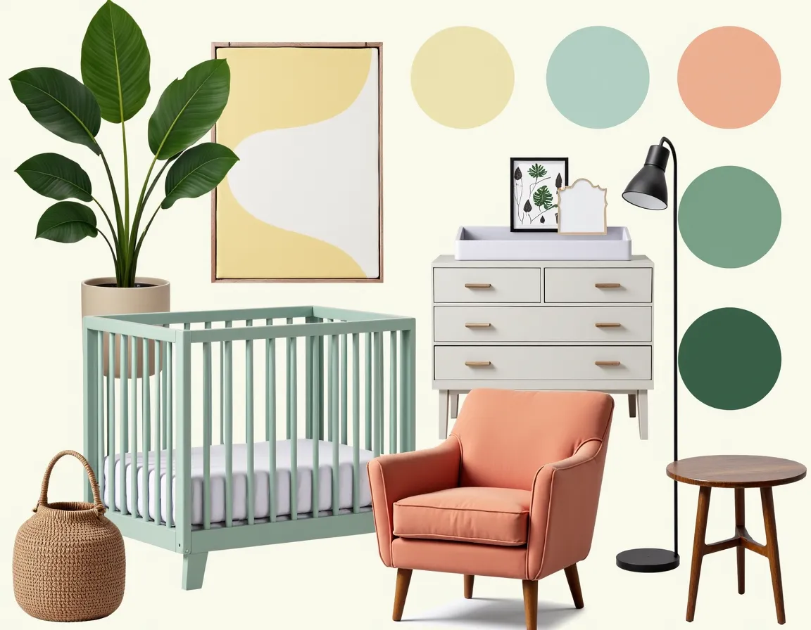
Why Is Butter Yellow Quietly Everywhere?
Butter yellow is the kind of color people distrust until they see it in the right room. It sounds sweeter and louder than it usually appears. In practice, the best versions read creamy, golden, and almost neutral. They warm a room without turning it childlike. That is why the color is landing so well in 2026. It adds optimism without demanding visual chaos.
The pairing that makes the trend feel adult is deep aubergine. Aubergine has the depth of a near-neutral but enough purple-brown richness to make yellow look intentional rather than decorative. Used together, they create a palette that feels intelligent, atmospheric, and more original than predictable beige plus black. If you are nervous about the jump, test butter yellow first in a chair, throw, or cushion rather than on the walls. Then compare the result against room references in living room mood board guide and bedroom mood board ideas.
The real advantage of a tool like MoodBoardAI AI generator is that you can drop butter yellow into a realistic room composition and see whether it glows or overwhelms. Once the direction works, move the selection into the MoodBoardAI mood board editor and compare it against a safer neutral version so you can judge whether the bolder move is genuinely better.
How Far Should You Go with Moody Interiors?
Moody palettes are now mainstream enough to consider seriously, but they still need discipline. Inky green, rich charcoal, dark terracotta, plum, and deep slate can make a room feel cocooning, expensive, and memorable. They can also make it feel heavy if the lighting, trim, and furniture are not working with them. The trick is not to treat dark walls as the entire concept. They need lighter support around them.
The best moody rooms keep the ceiling lighter, include one or two reliable light sources, and offset the darkness with warm woods, natural textiles, and lighter seating or rugs. Warm metals also matter. Aged brass, burnished copper, and darker gold stop the room from reading cold or theatrical. That practical balance shows up in multiple MoodBoardAI guides, especially bathroom mood board guide for finish coordination and dining room mood board ideas for how darker palettes still need visual breathing room.
If you are considering a dark palette, compare two versions of the same room: one with full dark walls and one with a single darker anchor wall. The side-by-side view often makes the right choice obvious. That kind of comparison is exactly where mood board creation with AI becomes useful rather than abstract.

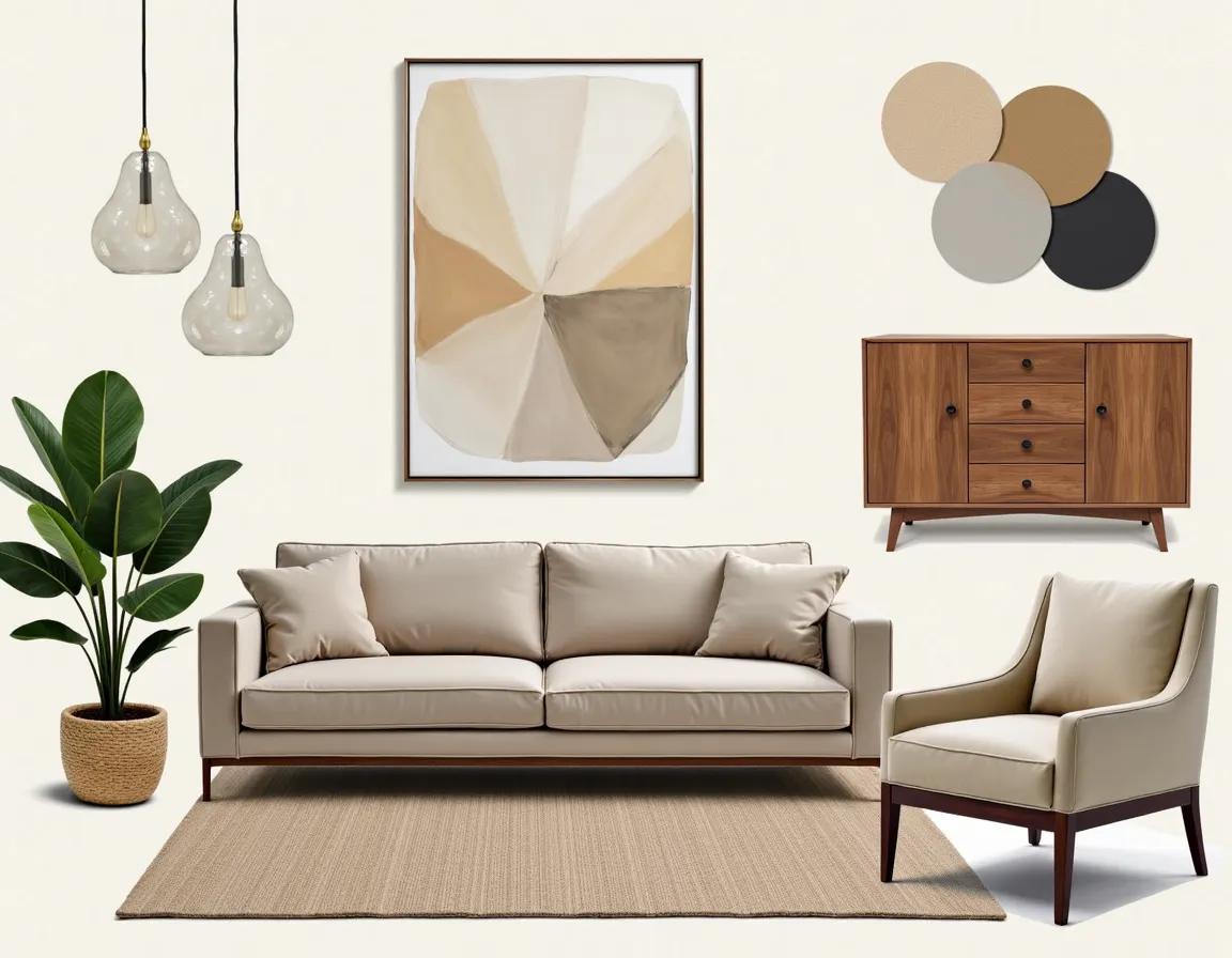
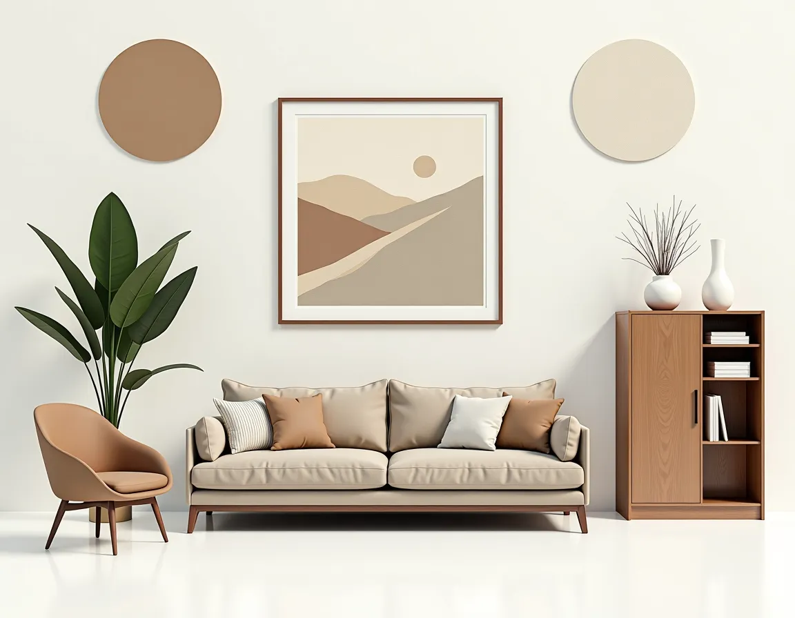
Why Are Warm Earthy Neutrals Still the Long Game?
Editorial trends come and go, but warm earthy neutrals keep surviving because they are flexible. Sand, clay, aged ivory, warm white, dusty sage, oat, mushroom, and terracotta all adapt well to changing furniture, changing seasons, and different design styles. That durability is why they remain the safest foundation for people who want longevity without boredom.
The important change in 2026 is that neutrals are doing more work. They are layered more intentionally, supported with more visible texture, and combined with stronger accent tones. A warm neutral room today is not the same as a safe beige room from a decade ago. It can still feel rich, especially when the board includes textured upholstery, washed wood, matte stone, and one stronger accent. For examples that lean more grounded and earthy, earth tone color palette 2026 mood board is the clearest internal reference.
Terracotta deserves special mention because it can function as either accent or architecture. In a sunny room it can become a full wall color that feels warm and alive rather than rustic. In smaller doses it works through ceramics, textiles, or art. If you want to avoid overdoing it, compare terracotta inside a larger neutral board using the same logic outlined in how to create a mood board for interior design.

Which Unexpected Palette Is Getting Stronger in 2026?
Dusty lavender paired with warm wood is one of the more surprising combinations gaining traction. It works because the lavender is desaturated and warm-based, not sugary or cool. Against honeyed oak, amber walnut, or even a mid-tone ash with warmth, the result feels softer than pink and more interesting than beige. It is especially effective in bedrooms, reading corners, and quieter living spaces.
This palette needs grounding. Without enough wood, darker anchors, or layered neutrals, it can float off into something too delicate. But handled well, it feels modern and intelligent. It also pairs nicely with some of the subtler lessons in bedroom mood board ideas and interior design color palette guide, where emotional tone matters as much as the literal color formula.
If the palette interests you but still feels risky, build two boards: one with lavender as a wall tone and one with lavender only in textiles or art. Tools matter here because palette fear is often just uncertainty. Seeing the room composed clearly inside the MoodBoardAI mood board editor makes it easier to decide whether the softer move or the bolder move feels more believable.

How Should You Test a 2026 Palette Before You Commit?
Our team always recommends this: paint samples still matter, but they are not enough on their own. A wall color that looks perfect on a single board can fail once it meets your sofa, flooring, curtains, and lighting. What you need is a full palette test. Pull room references, add your real or approximate furniture pieces, include the floor and wood tones, and look at the board as a system. You are testing mood, not just matching.
A simple way to do it is to collect one full-room image, one detail image, one material image, and one swatch for each major color. Then add your own room photo and test the direction with MoodBoardAI AI generator. Once you can see the palette in a room context, the decision becomes much less abstract. That workflow connects well with best free moodboard tools compared if you want a broader sense of the available process options.
You can also use internal room guides to keep the palette honest. Check your chosen direction against living room mood board guide, kitchen mood board ideas and inspiration, and bathroom mood board guide to make sure the same palette logic still works across rooms with different lighting and materials. A palette that survives those comparisons is usually strong enough to live with long-term.

Which 2026 Palette Is Right for Your Room?
If you want the room to feel welcoming and easy, start with earthy neutrals and add butter yellow sparingly. If you want the room to feel moodier and more sophisticated, lean into darker walls supported by warm metals and light furniture. If you want the room to feel quiet and thoughtful, test dusty lavender with warm wood and plenty of visual restraint.
The better question is what the room needs to do. A social living room can take more contrast. A bedroom should usually carry less visual pressure. A kitchen often needs the most discipline because hard finishes lock the palette in for longer. That is why palette work belongs inside a mood board from the start. The room function, furniture tone, material finish, and lighting quality all need to be evaluated together.
We've seen too many costly repaints to say it any other way: whatever direction you choose, build the board before you buy. Compare the result with interior design color palette guide, earth tone color palette 2026 mood board, and how to create a mood board for interior design, then test the room with MoodBoardAI AI generator. That sequence gives you a much better chance of choosing a palette that still feels right once the room is finished.
2026 Color Palette Comparison
Here is a quick comparison of the trending 2026 palettes to help you decide which direction suits your space:
| Palette Name | Key Colors | Room Suitability | Mood / Vibe | Best Paired With |
|---|---|---|---|---|
| Butter Yellow & Aubergine | Creamy gold, deep plum-brown, warm ivory | Living room, dining room | Optimistic, sophisticated | Warm wood, linen, aged brass |
| Moody Darks | Inky green, rich charcoal, deep slate, plum | Bedroom, study, bathroom | Cocooning, dramatic, luxurious | Warm metals, lighter rugs, natural textiles |
| Warm Earthy Neutrals | Sand, clay, oat, mushroom, terracotta | Any room | Grounded, timeless, flexible | Textured upholstery, matte stone, washed wood |
| Dusty Lavender & Wood | Desaturated lavender, honeyed oak, soft cream | Bedroom, reading nook | Quiet, modern, thoughtful | Warm wood, darker anchors, layered neutrals |
| Terracotta Forward | Rust, burnt sienna, warm cream, olive | Kitchen, living room, entryway | Warm, earthy, inviting | Natural stone, raw linen, matte ceramics |
| Sage & Charcoal | Dusty sage, warm charcoal, soft white, taupe | Bathroom, bedroom, office | Calm, grounding, spa-like | Marble, brushed nickel, cotton |
What Questions Do People Still Ask About 2026 Interior Color Palettes?
What are the biggest interior color trends for 2026?
The biggest interior color directions for 2026 are butter yellow with deep aubergine, moody dark palettes like inky green and rich charcoal, warm earthy neutrals with more layering and texture, and dusty lavender paired with warm wood tones.
Is grey still in style for interiors in 2026?
Grey is still usable in 2026, but the direction has shifted away from cool greys toward warmer greys with yellow or brown undertones. The broader trend is warmth, not the total disappearance of grey.
How do I know if a color palette will work in my specific room?
You need to test the palette in context because light changes everything. A full mood board with walls, flooring, furniture, textiles, and accent colors gives a more reliable answer than looking at paint chips on their own.
What is the best accent color to pair with warm neutrals in 2026?
Dusty sage, terracotta, butter yellow, deep aubergine, and inky navy are all strong 2026 accent options for warm neutral rooms. The best choice depends on whether you want the room to feel calmer, softer, or more dramatic.
How many colors should be in an interior palette?
Most rooms work best with a 60-30-10 structure: one dominant color, one secondary color, and one accent. Two to three colors used with clear proportions create a palette that feels complete without becoming chaotic.
Can I mix warm and cool tones in the same room?
Yes, but with care. The most successful mixed-temperature rooms use one dominant temperature — usually warm in 2026 — and add a single cool element as contrast. For example, a warm neutral room with one dusty blue accent piece or cool grey stone can feel balanced. The key is keeping 80 percent of the room in one temperature family and limiting the counterpoint to small, intentional moments.