Spring 2026 Mood Board: Fresh Color Palettes to Try in Your Living Room
Spring 2026 mood board ideas are visual plans that combine fresh seasonal colors, materials, and furniture references so you can test a spring palette before changing your room. For home decor, that usually means building around one airy lead tone, one grounding neutral, and one brighter accent that makes the room feel newly awake. In 2026, the combinations leading that shift are sage green, soft coral, butter yellow, warm sand, and pale wood.
That sounds simple on paper, but seasonal mood boards fail when the colors are picked as isolated trends instead of as a full-room system. The question is not whether a tone is popular. It is whether it still works once your sofa, rug, wood finish, artwork, and daylight all join the conversation. We use MoodBoardAI's AI generator for the first pass because it is fast, then use the mood board editor to refine the exact spring color palette 2026 direction that feels right for the room.
Key Takeaways
- Spring 2026 mood boards work best when fresh color is balanced with warm neutrals and natural texture.
- Sage, soft coral, and butter yellow are the three most useful spring tones because they brighten rooms without making them feel sharp or temporary.
- Seasonal mood boards need room context so the palette can be judged against lighting, upholstery, flooring, and wood tone.
- Living rooms are the best place to test spring trends because textiles and decor can shift the mood without a full renovation.
- Use MoodBoardAI to compare quickly in the AI generator, then refine your final scheme in the mood board editor.
Why Does a Spring Mood Board Matter More in 2026?
Spring interiors always promise freshness, but in 2026 that freshness is noticeably warmer and more livable than the crisp pastel look many people still associate with seasonal decorating. The current spring interior design trends are softer, dustier, and more material-aware. Instead of bright mint, think sage. Instead of candy pink, think soft coral. Instead of lemon, think butter yellow. The room still feels lighter, but it does not look temporary.
That is exactly why a spring mood board matters. These colors are subtle enough that a single swatch does not tell the full story. A butter yellow that feels warm and elegant next to cream linen may feel weak next to cool grey upholstery. A coral that looks fresh in sunlight may look sugary under warm lamps unless it is balanced with sand or oak. If you want a broader view of the bigger shift behind these palettes, interior color palette trends 2026 is the best supporting guide in the MBA blog.
The goal is not to decorate for three months and start over. The goal is to create a palette that feels seasonally alive now and still makes sense in late summer and early fall.

Which Spring 2026 Colors Are Actually Worth Using at Home?
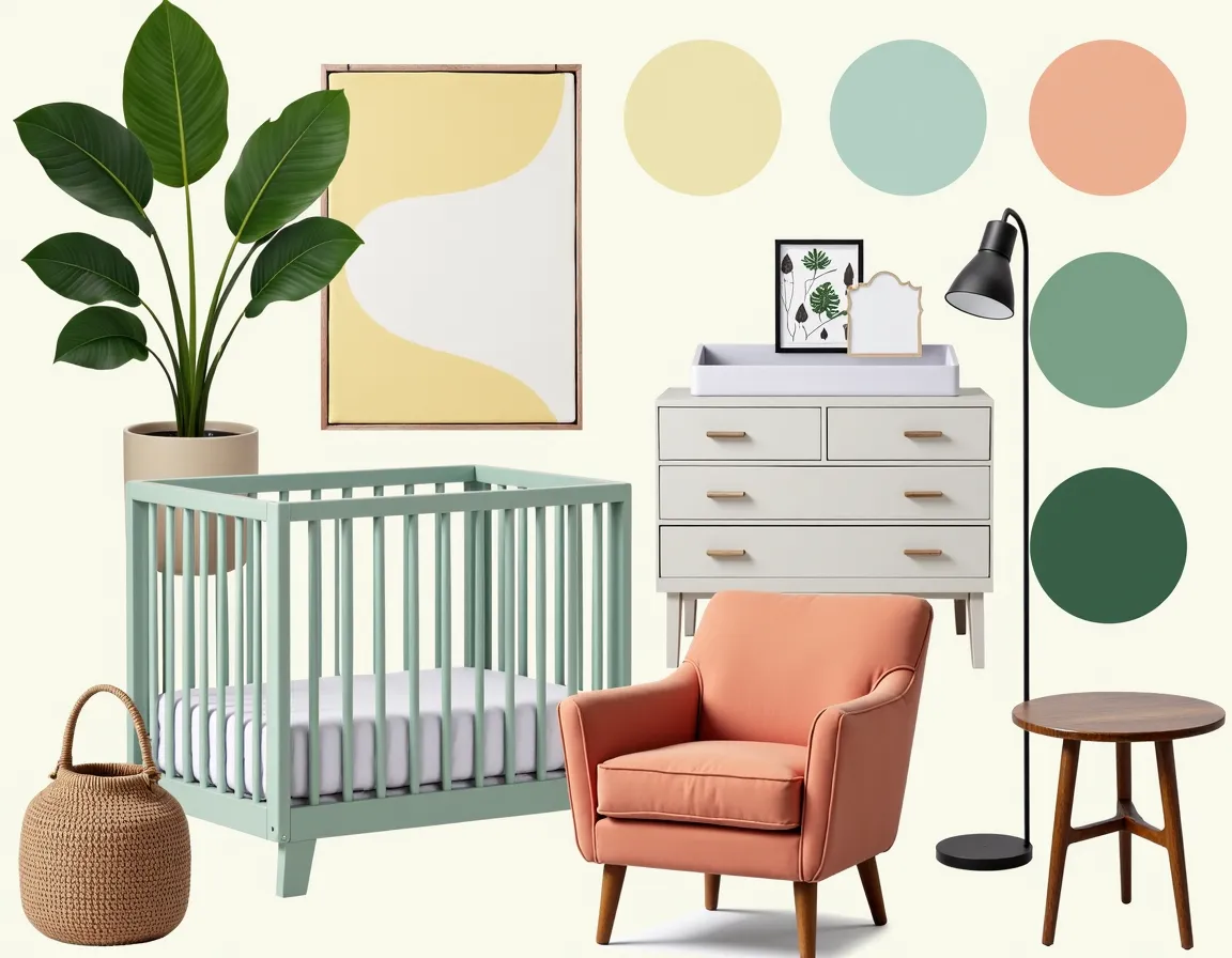
The strongest spring mood board ideas are built around colors that brighten a room while staying flexible enough for real furniture and real life. Sage green is the easiest starting point because it behaves almost like a neutral. It softens the room, pairs well with wood, and works in natural light and evening light. Soft coral is the tone that adds lift and warmth. Butter yellow brings glow, especially in rooms that need more optimism. Warm sand, oat, chalky white, and pale wood are the support system that keeps all of this grounded.
We have found that spring color palettes work best when only one of the tones is truly attention-seeking. If coral is the expressive note, let the rest of the room breathe. If butter yellow is leading, keep the supporting materials quieter. If sage is dominant, the room can usually handle one more accent without stress. That logic lines up with the planning method in interior design color palette guide and the room-specific examples in living room mood board guide.
A spring palette should feel like fresh air, not a highlighter pack. The board helps you tell the difference early.
How Should You Use Sage Green in a Spring Living Room?
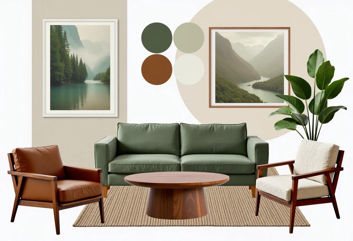
Sage is still strong in 2026 because it solves several problems at once. It feels organic, supports natural materials, softens visual contrast, and can lean modern, bohemian, coastal, or traditional depending on what you pair with it. In a spring living room, sage works best as the largest color after your neutral base. That might mean one painted wall, a sofa, a large rug pattern, or a repeated accent across upholstery and textiles.
The easiest formula is sage plus cream plus pale oak. That combination immediately feels lighter than winter palettes and leaves room for seasonal accents. If the room needs more life, add small coral or butter yellow notes through art, pillows, or a side chair. If the room already has strong architecture or dark flooring, keep sage softer and dustier. You want it to freshen the space, not compete with it.
For people who worry sage is overused, the reality is that it is only boring when the board around it is boring. Texture and contrast make the difference. Add boucle, linen, warm wood, or a more sculptural coffee table and the color wakes up fast.

What Is the Best Way to Use Soft Coral Without Overdoing It?
Soft coral is one of the most useful spring color palette 2026 accents because it brings warmth without the heaviness of terracotta and without the sweetness of a brighter pink. The mistake is trying to make it carry the whole room. Coral is strongest as a supporting burst: a pillow group, one chair, a piece of art, a ceramic lamp, or a patterned textile with sand and cream around it.
It gets much easier to use once you stop pairing it with cool greys. Coral wants warmth around it. Sand, oat, chalk white, pale wood, muted olive, and sage are much friendlier companions. In living rooms, a small coral note can shift the whole mood from neutral to spring without changing the architecture. That makes it ideal for renters or anyone who wants a seasonal mood board that does not require repainting.
If you are unsure whether coral belongs in your room, build two versions of the same board: one with coral and one with butter yellow. In our experience, one of those reads immediately more “you,” and the comparison is faster inside MoodBoardAI's mood board editor than it is in conversation.

Where Does Butter Yellow Fit Into Spring Interior Design Trends?
Butter yellow is the tone that makes spring 2026 feel brighter than the moodier palettes of the past year. Used well, it looks creamy, uplifting, and sophisticated. Used badly, it looks thin. The difference is support. Butter yellow needs richer neutrals, clear texture, and often a wood tone that feels honeyed rather than greyed out.
In a living room, butter yellow works especially well in textiles, painted millwork, a statement chair, or art. It can also sit quietly in the palette as the warm undertone that keeps white or cream from feeling cold. If you are using both butter yellow and coral, let one dominate and keep the other secondary. Too much of both and the room can become louder than a spring board should be.
For a more grounded seasonal look, butter yellow pairs well with sage and oat. For a slightly more playful one, it can sit next to coral and sky blue. If you want to compare those brighter options against more timeless ones, earth tone color palette 2026 mood board is a useful counterbalance.

How Do You Build a Seasonal Mood Board That Still Feels Like Your Home?
This is the difference between trend-following and good design. A seasonal mood board should translate the season into your existing home, not pretend you live in a different one. If your space already leans minimal, your spring board might only add sage textiles, pale wood, and one coral detail. If your room is already layered and eclectic, your spring palette can take more color movement because the space is built to carry it.
The easiest method is to start with what is not changing: sofa color, flooring, major wood finish, and wall tone. Then add one spring lead color, one spring accent, and two material references that make the palette feel tactile. We often tell people to limit their board to eight or ten elements for the first draft. More than that and you stop seeing the structure. The process outlined in how to create a mood board for interior design is useful here because it forces the board to stay readable.
You do not need a full redesign to get a spring reset. Often, a changed rug, new pillows, one piece of art, and a lighting tweak are enough if the board is disciplined.
How Can MoodBoardAI Help You Compare Spring Mood Board Ideas Faster?
The practical value is speed and clarity. A spring mood board is really a comparison exercise. You are deciding whether sage should dominate or support, whether coral feels fresh or too sweet, whether butter yellow glows or washes out, and whether your room can carry one bright note or two. That is hard to judge from random screenshots. It is much easier when the options are generated and then edited in a consistent format.
With MoodBoardAI's AI generator, you can create multiple seasonal directions in under 30 seconds and see how they read as full rooms. Then, in the mood board editor, you can swap in real fabrics, paint references, product shots, and close-up materials. We have seen this save people from the common spring mistake of buying cheerful accents that look disconnected once they get home.
If you want to pressure-test your workflow, best free moodboard tools compared is also worth reading, because it shows why visual planning matters even when the room update is small.
Which Spring 2026 Palette Is Best for Your Living Room?
If you want a safe seasonal upgrade, choose sage, cream, and light wood. If you want more warmth and personality, go for sand, soft coral, and oat. If your room needs visible brightness, butter yellow with sage and cream is one of the best spring mood board ideas 2026 has produced. If you want a more coastal or airy direction, use sand, pale blue, and coral with texture doing most of the work.
The right answer depends on the room's light and your tolerance for change. A north-facing room may need the optimism of butter yellow or coral more than a sun-filled room does. A room with strong existing greenery outside the windows may only need sand and pale wood to feel spring-ready. The board reveals that quickly.
Spring decorating becomes expensive when you shop emotionally and impossible to regret when you plan visually. That is the whole point of the mood board.
How Do the Top Spring 2026 Mood Board Palettes Compare?
This comparison makes it easier to decide which spring direction is worth testing first.
| Palette | Main colors | Best for | Mood |
|---|---|---|---|
| Sage and cream | Sage, cream, pale oak | Almost any living room | Fresh, calm, adaptable |
| Coral and sand | Soft coral, sand, oat, light wood | Rooms that need warmth | Sunny, soft, welcoming |
| Butter yellow and oat | Butter yellow, oat, cream, honeyed wood | Dim rooms or neutral spaces | Glowing, optimistic, gentle |
| Coastal spring | Sand, pale blue, coral, woven texture | Airy or beach-adjacent interiors | Light, open, easygoing |
| Sage and coral mix | Sage, coral, cream, walnut | Layered or eclectic rooms | Balanced, modern, expressive |
What Questions Do People Still Ask About Spring 2026 Mood Boards?
What colors are trending for spring 2026 interiors?
Sage green, soft coral, butter yellow, warm sand, pale sky blue, and light wood tones are among the strongest spring 2026 interior colors. They feel fresher and brighter than winter palettes without becoming harsh. The reason they work is that they bring lightness while still sitting comfortably next to natural materials and softer neutrals.
How do you build a spring 2026 mood board?
Start with one lead color, one supporting neutral, and one bright accent. Then add references for upholstery, rugs, wood tone, and lighting so the palette can be judged in room context. Seasonal mood boards work best when you can see the colors in a full composition rather than as isolated paint chips or saved screenshots.
Does sage green still work in 2026?
Yes. Sage is still useful in 2026 because it is calm, flexible, and easy to pair with warmer accents like coral, butter yellow, cream, and oak. It does not feel like a novelty color anymore. It works more like a soft neutral, which is why it remains one of the strongest spring interior design trends.
How do you use soft coral in home decor without making it feel too sweet?
Use soft coral in smaller doses and balance it with warmer neutrals. Pillows, art, one accent chair, or a lamp base are often enough. The room feels more grown-up when coral is one note in a layered palette instead of the entire concept. Sand, oat, sage, and pale wood are especially good partners.
What is the easiest spring color palette for a living room?
Sage, cream, and light wood is the easiest spring palette to live with. It feels seasonally fresh, supports many styles, and can take coral or butter yellow accents if you want a brighter update later. It is also one of the simplest palettes to source because those tones are widely available in textiles and decor.
Can AI help create a seasonal mood board?
Yes. AI is useful for seasonal boards because it gives you several directions quickly, which is exactly what you need when the differences between good options are subtle. Once the first concepts exist, you can refine them with exact colors, products, and textures in a mood board editor until the palette feels believable for your room.