Interior Design Color Palette Guide: How to Choose Colors for Any Room
Choosing a color palette is often the hardest part of any interior design project. Paint chips never look the same as they do on the wall, and colors that look beautiful together in a tile shop can feel completely wrong once they are surrounded by furniture, fabric, and natural light. A good color palette is not just about the colors you pick. It is about understanding how they interact with each other and with the specific conditions of your home.
If you want to start faster, you can use MoodBoardAI to generate color palette directions for any room type, then refine the strongest concept in the mood board editor by testing it against real materials, furniture, and finishes.
Understanding undertones before you pick a color
Every paint color has an undertone that becomes visible when it interacts with other surfaces in the room. A white wall can read pink, yellow, green, or blue depending on the undertone and the surrounding light. This is why matching colors by eye from a small chip nearly always fails.
Warm undertones (red, orange, yellow) make spaces feel cozy and welcoming. Cool undertones (blue, green, purple) make spaces feel calm, airy, or more formal. Neutral undertones sit between the two and are often more versatile, though they can still shift depending on the room's light conditions.
Before selecting any wall color, identify whether the room gets warm southern light or cooler northern light. Warm rooms can handle cooler tones without feeling cold. Cool northern rooms tend to benefit from warmer hues.
The 60-30-10 rule for interior color balance
A practical framework for balancing colors in any room is the 60-30-10 rule. Sixty percent of the room is your dominant color, usually the walls and large upholstery. Thirty percent is the secondary color, often furniture, rugs, and curtains. Ten percent is the accent color used in cushions, art, lamps, and small accessories.
This ratio is not absolute. Some rooms work beautifully with a 70-20-10 split. Others lean into more balance. But it is a useful starting point because it prevents the most common palette mistake: using all your colors in equal measure, which makes a room feel busy and directionless.
The ten percent accent is also where you have the most freedom to introduce something unexpected without overwhelming the room. A deep terracotta, emerald green, or cobalt blue can add life to a neutral palette when it appears in small doses.
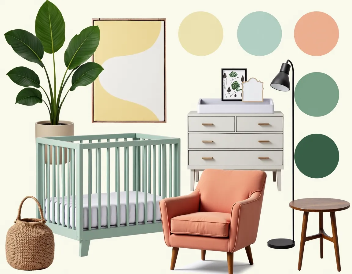
Building a cohesive palette from an anchor piece
One of the most reliable methods for developing a room palette is to start from an anchor piece you already love or plan to keep. A patterned rug, an artwork, a sofa fabric, or a set of curtains can all serve as anchor pieces. Pull the key colors from the anchor and build outward. This approach makes cohesion almost automatic because every color you choose is grounded in something already present in the room.
If you are starting from scratch, choose your largest or most expensive purchase first, then build the palette around it. It is much easier to find paint that coordinates with a sofa than to find a sofa that works with paint you already applied.
Warm neutrals versus cool neutrals: knowing the difference
Not all neutrals are equal. Warm neutrals like cream, oat, beige, caramel, and warm taupe work well with natural wood tones, terracotta, olive, and brass. Cool neutrals like pale gray, white with a blue undertone, greige with green in it, and dove all suit cooler palettes with chrome, glass, bluestone, and painted furniture.
Mixing warm and cool neutrals without intention is one of the most common reasons rooms feel slightly off even when each piece looks fine in isolation. A warm oak floor with cool gray walls and cold white trim creates a disconnect that many people feel but cannot identify.
When building a mood board, identify whether your main material palette is warm or cool, then anchor everything else to that temperature.
Monochromatic palettes: more variation than they sound
A monochromatic palette does not mean a single color applied everywhere. It means working within one hue family while varying value, saturation, and texture. A room in tones of blue can include pale sky on the walls, deep navy on the sofa, slate in the rug, soft indigo in a cushion, and aged blue-gray on painted furniture. The result feels calm and sophisticated because the eye is not jumping between competing hues.
Texture does critical work in monochromatic rooms. When the palette is limited, material contrast keeps the room from feeling flat. Mix matte, sheen, rough, and smooth surfaces freely.
Complementary and analogous color schemes
Complementary palettes place opposing colors on the color wheel against each other. Blue and orange. Green and red. Purple and yellow. These pairings create energy and contrast, and they work best when one color clearly dominates and the other appears as an accent rather than an equal partner. A room with blue-green walls, warm wood, and rust or amber accents is using a soft complementary approach.
Analogous palettes use colors that sit beside each other on the wheel, like green, blue-green, and teal, or burnt orange, rust, and ochre. These palettes feel natural and harmonious because the colors share undertones. They work especially well in spaces meant to feel calm, such as bedrooms, living rooms, and reading corners.
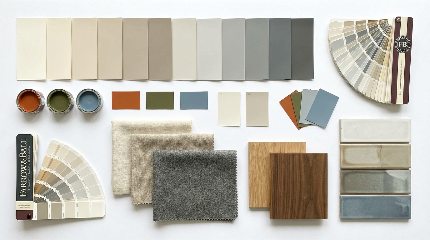
Testing colors in your actual space
Paint chips lie. The only reliable way to know how a color will look in your room is to test it. Apply large swatches of at least 30cm by 30cm on different walls, ideally near a window, near a corner, and on a wall that gets little direct light. Observe them at different times of day and in artificial light. What reads as warm caramel in the morning may look quite different under evening lamp light.
The same principle applies to fabric swatches, tile samples, and flooring. Before committing to anything, live with the sample in the actual space for a few days. This step eliminates most expensive mistakes.
Common interior design color palette mistakes
Choosing paint first before knowing what furniture and materials will be in the room is the single most common error. The paint is the cheapest and most changeable element, so it makes sense to choose it last, once you know what you are working around.
Another mistake is ignoring fixed elements. Flooring, tile, stonework, and existing woodwork all have undertones that need to inform the palette. Trying to work against fixed warm wood floors with a cool gray palette creates constant friction.
Matching too precisely is also a trap. Colors that are too close together without variation in value or texture make a room look flat. Aim for harmony and contrast, not uniformity.
Using AI to explore color directions faster
AI tools are useful when you are in the early exploration phase and want to see several color directions before committing to samples. You can generate mood boards in MoodBoardAI that reflect different palette approaches for the same room type, compare how warm and cool directions feel, and then take the strongest concept forward into a more detailed planning process.
The board also helps you communicate the palette direction to trades, suppliers, or family members who need to understand the vision before purchases are made.
Frequently asked questions
How do I choose a color palette for my home?
Start with an anchor piece you already own or plan to buy. Pull the key colors from it and build your palette outward. Make sure the temperature of your palette (warm or cool) stays consistent throughout the room.
What is the 60-30-10 rule in interior design?
It is a guide for distributing color: sixty percent on dominant surfaces like walls and large furniture, thirty percent on secondary pieces like rugs and curtains, and ten percent on accent details like cushions, art, and accessories.
Should I match colors exactly in interior design?
No. Exact matches flatten a room. Aim for harmony with variation in value, saturation, and material texture instead of perfect uniformity.
What are undertones and why do they matter?
Undertones are the subtle secondary hue embedded in a color, for example a gray that reads blue or a white that reads yellow. When undertones clash between your walls, floor, and fabrics, the room feels slightly wrong even if each piece looks fine in isolation.
Can I use more than three colors in a room?
Yes, but keep a clear hierarchy. One dominant color, one supporting color, and the rest as accents. Using five or six colors in roughly equal measure usually creates visual noise.
How do I test paint colors properly?
Apply large swatches of at least 30cm by 30cm on different walls and observe them at multiple times of day in both natural and artificial light. Never rely on small chips or screen colors alone.
What are some safe interior design color palettes?
Warm whites with oak and brass, warm taupe with terracotta accents, pale blue-green with linen and natural wood, and charcoal with cream and warm metals are all palettes that work reliably across a wide range of room types.