How to Build a Boho Mood Board That Actually Works

A boho mood board is the difference between a room that feels intentionally layered and a room that just looks like you bought everything from the same festival market stall. Bohemian is one of the most searched interior design styles, but it is also one of the easiest to do badly — not because the style is complicated, but because the principles are misunderstood. People shop before they plan, layer before they anchor, and add personality before they establish structure. The mood board flips that sequence.
We have worked through hundreds of bohemian design projects using MoodBoardAI's AI generator and the mood board editor, and the pattern is consistent: the rooms that feel right started with a board that set the palette and the dominant texture first. The ones that went sideways skipped that step. Boho is forgiving in style but demanding in system.
Key Takeaways
- Boho mood boards work best when you establish an anchor palette and dominant material before adding personality pieces.
- Texture is more important than color in a bohemian interior — the right mix of materials is what creates warmth without clutter.
- Warm neutrals are the foundation, not the whole story — cream, sand, terracotta, and warm beige give you room to layer without chaos.
- The edit is as important as the addition — successful boho rooms have restraint in unexpected places.
- Use MoodBoardAI to test directions in the AI generator before buying a single piece, then refine the full system in the mood board editor.
What Actually Makes a Boho Interior Work?
The honest answer is that bohemian interiors have more structure than they look like they do. The lived-in eclecticism that makes a boho room feel warm and layered is usually the result of someone who chose carefully, edited ruthlessly, and bought things that belong to the same material family even when the colors and patterns vary. That is what a boho mood board forces you to figure out before you spend anything.
The biggest misconception is that boho means more. More textiles, more plants, more color, more wall art, more baskets. But the rooms that read as eclectic and intentional rather than chaotic and exhausting are usually the ones where someone decided on a dominant texture early. Rattan and linen? That is one material family. Kilim rugs and mudcloth? That is another. When the materials are coherent, the room absorbs color and pattern without losing clarity.
If you want to understand why planning comes first in any style — but especially in boho — the framework in how to create a mood board for interior design is worth reading before you start sourcing. It explains why collecting images without deciding on an anchor always produces boards that look unfocused when compared side by side.
How Do You Choose a Boho Color Palette That Won't Look Muddy?
Most boho color palette failures come from one of two directions: too many saturated tones competing at once, or a neutral base that is too cool for the warm materials typically used in bohemian rooms. The solution is to start with a warm neutral — cream, sand, soft terracotta, warm beige — and let that carry 60 to 70 percent of the visual weight. Everything you layer on top becomes easier to manage once the foundation is warm.
The traditional boho palette leans into amber, rust, terracotta, dusty rose, warm olive, and aged brass, but modern boho — sometimes called boho-chic or refined boho — has shifted toward softer expressions of those tones. Warm oatmeal, faded indigo, muted marigold, dusty sage, and dried clay all sit in the current direction. You do not need all of them. In fact, picking three tones and staying disciplined usually produces a more readable room than trying to include every earth tone you love.
A useful check: compare your palette against the ideas in earth tone color palette 2026 mood board. If your boho palette lives comfortably within that framework, it will hold together as you add pattern and texture. If your palette keeps pulling toward bright saturated colors that do not have an earthy warmth behind them, you are building something closer to eclectic or maximalist than bohemian. There is nothing wrong with that, but the label matters when you are sourcing.
Why Is Texture the Real Star of a Boho Mood Board?
Color gets all the credit in boho inspiration images, but texture is what holds the room together. A rattan chair, a jute rug, a linen sofa cover, a macramé wall hanging, a handwoven throw, a terracotta pot, and a leather pouf are all different textures with different optical weights and different stories. When you mix them well, the room reads as collected and personal. When you mix them badly, it looks like the inside of a souvenir shop.
The simplest rule is to anchor on one dominant natural material and build from there. If the dominant texture is jute and rattan, soften it with linen and cotton. If the dominant texture is kilim or handwoven textiles, balance it with smoother surfaces — a plastered wall, a leather seat, bare wood. The contrast is what creates depth. Pure texture-on-texture with no relief is just busy. Pure smooth and flat with one or two boho pieces looks costume-y.
When building your boho mood board, pull actual texture references, not just product shots. Close-up images of a woven basket, a worn leather belt buckle, the grain of a macramé knot, or the loose weave of a linen throw communicate more than ten full-room shots. Once the texture story is clear on the board, the furniture and accent choices become easier because you are filling a system rather than reacting to individual items. The room-specific guides in living room mood board guide and bedroom mood board ideas both treat texture as the primary planning tool, not the finishing touch.

What Goes on a Boho Mood Board, Specifically?
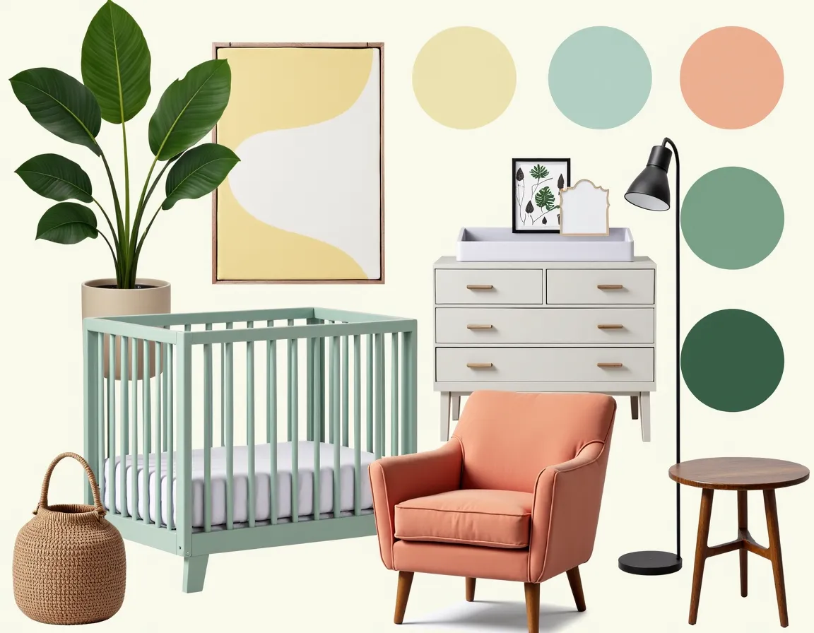
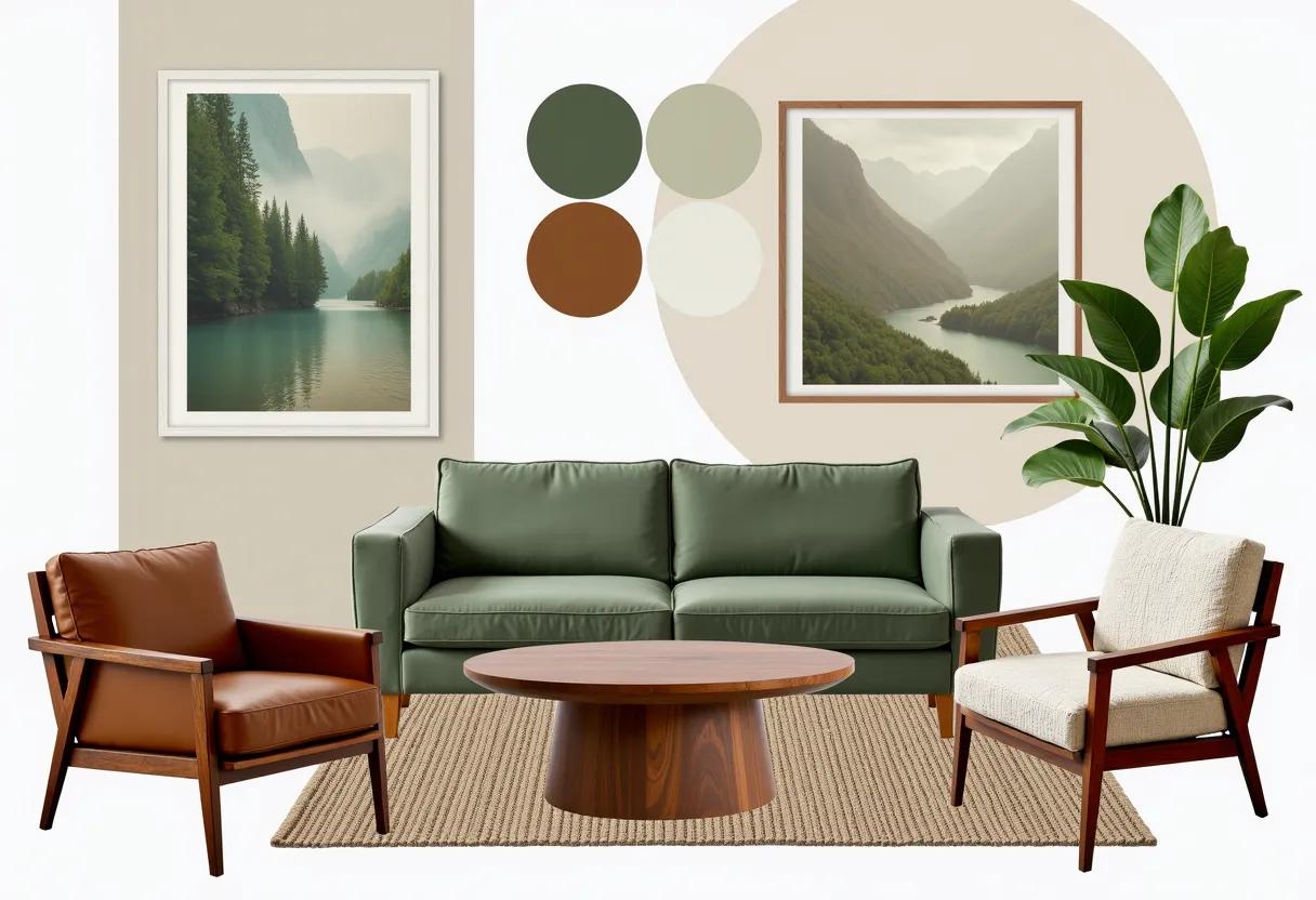
A strong boho mood board has six to ten elements, organized so you can see the full room direction without the individual pieces competing. Start with the palette strip — three to four colors, ideally shown as fabric swatches or material samples rather than paint chips, because boho rooms are more about how color lives in materials than how it looks on walls.
Add the dominant furniture anchor — most often a sofa, daybed, or large area rug, since those are the pieces that set the visual weight. Then add two or three material texture references: a close-up of a weave, a rattan detail, a worn leather finish. Include one or two full-room reference images that carry the atmosphere you are after. Finally, add specific accents — a kilim pattern, a ceramic piece, a plant reference — that confirm the board is reading as boho and not just earthy neutral.
The board should feel complete enough that if you handed it to someone who had never heard the word boho, they would recognize the direction. Use MoodBoardAI's AI generator to test the full-room expression before locking anything in. You can generate several boho directions in minutes and see which atmosphere matches what you were actually picturing rather than what looked good on Pinterest in the abstract.

Which Boho Styles Should You Know Before Starting?
Bohemian is not a single look anymore. The family has branched in several directions, and which branch you are actually drawn to changes what should go on your board. Classic boho is warm and maximalist — layered kilims, rich terracotta, macramé, abundant plants, abundant pattern. Modern boho or boho-chic strips the maximalism back but keeps the warmth, natural materials, and handmade detail. Coastal boho adds white, bleached wood, and lighter blues to the traditional warm palette. Nordic boho blends bohemian texture with Scandinavian restraint — a difficult combination that works when it is planned carefully, and comes apart fast when it is not.
If you are drawn to Japandi but also love boho references, the overlap exists in warm neutrals and natural material preference, but the editing discipline is much stricter in Japandi. That comparison is worth reading in detail in japandi mood board before deciding which direction your board is actually pulling toward.
Knowing which branch you are in also helps you set boundaries on sourcing. If you are building a modern boho board, a heavily patinated kilim and a maximalist layering approach would feel out of place, even though it is technically "boho." The board is the tool that shows you which sub-direction the pieces are actually building toward.
| Boho Style | Key Materials | Color Palette | Editing Level |
|---|---|---|---|
| Classic Boho | Kilims, macramé, rattan, layered textiles | Rich terracotta, saffron, deep teal, warm neutrals | Low — layering is the point |
| Modern Boho / Boho-Chic | Linen, light rattan, handmade ceramics | Cream, sand, muted ochre, soft blush | Medium — warmth with restraint |
| Coastal Boho | Bleached wood, jute, lightweight cotton | White, soft blue, sandy beige, driftwood grey | Medium — airy, not heavy |
| Nordic Boho | Pale wood, wool, minimal woven accents | Off-white, warm grey, pale terracotta, sage | High — Scandi discipline meets boho warmth |
What Are the Most Common Boho Mood Board Mistakes?
The first mistake is saving too many inspiration images before establishing an anchor. When your image library has forty boho rooms, each one pulls the board in a slightly different direction. The solution is to pick one or two rooms that represent the specific atmosphere you want — not the style generally, but the exact feeling — and treat those as references rather than inspiration.
The second mistake is confusing layering with accumulation. Boho layering is intentional — three textiles where each one adds something different. Accumulation is buying every woven item you find and hoping the room absorbs it. The board is the place where you make that distinction before spending money.
The third mistake is not testing the palette against real light conditions. A terracotta that looks warm and grounded in a sunny south-facing room can look flat or muddy in a dim north-facing space. Using MoodBoardAI's AI generator to see how the palette reads in a full-room context helps catch that mismatch before you commit to a sofa or a painted wall. Finishing the full system inside the mood board editor then lets you lock in the exact references for fabrics, finishes, and accent pieces that need to arrive before the room can be called complete.

How Do You Make a Boho Room Feel Intentional Rather Than Collected?
The word that separates intentional boho from accumulated boho is edit. Great boho rooms have surprising restraint in some places — an empty corner, a single large plant instead of six small ones, one strong textile instead of four medium ones. The edit creates breathing room. Breathing room makes the pieces you did choose look chosen, not just present.
A useful exercise is to build your board twice. First pass: add everything you love, every texture, every accent, every color idea. Second pass: remove anything that is doing the same job as something else on the board. If you have four woven textures, keep the two most interesting ones. If you have three terracotta tones, keep the one that complements the rest of the palette most naturally. What remains after the second pass is usually a stronger board than the first one, even though it has fewer elements.
That process mirrors what the best boho rooms actually look like in practice, which is why the planning discipline in how to create a mood board for interior design and the palette logic in interior design color palette guide both apply even to a style that appears to celebrate excess. Even boho has rules. They are just rules about warmth, texture coherence, and deliberate edit rather than rules about clean lines and negative space.

Which Rooms Benefit Most from a Boho Mood Board?
Living rooms are the most natural fit because they are the most layered rooms in most homes. A living room boho board typically involves the most elements — sofa, rug, coffee table, accent chairs, textiles, plants, lighting, wall treatment, and decor — which means a board saves you from sourcing these in isolation and only discovering the mismatches when they are all in the room at once.
Bedrooms are the second best candidate, particularly if you want a boho bedroom that feels calm rather than stimulating at night. The boho bedroom board needs to resolve the same texture and palette questions, but with a stronger emphasis on softness and warmth. Rough materials and saturated patterns can work during the day but disturb the evening mood in a bedroom unless the board has tested that combination in context.
For boho dining rooms and smaller rooms, the board becomes even more important because scale limits what you can include. Every piece needs to earn its place. A dining room boho board built around one strong rug, warm pendant lighting, and a mix of seating materials often looks more considered than a heavily decorated version of the same space. The examples in dining room mood board ideas are worth reviewing if the dining room is your starting point.

How Does AI Help You Build a Boho Board Faster?
Boho is one of the styles where AI tools are genuinely useful because the style depends on testing how individual elements work together rather than how they look in isolation. A kilim rug that looks perfect in a product photo might fight with the sofa upholstery you already own. A macramé piece that reads as charming in someone else's white-walled rental can get lost in your wood-panelled room. Seeing the combination in a full-room context before buying is what separates a successful boho space from an expensive guessing game.
With MoodBoardAI's AI generator, you can test different boho color directions — warm terracotta versus cool blue-indigo, rattan-dominant versus textile-dominant — in seconds. Once you have a direction that matches the atmosphere you are actually after, the mood board editor lets you build the full system with real product references, fabric swatches, and the specific pieces you are considering. At that point the board becomes a buying guide rather than a vision board, which is the most practical outcome a boho planning process can deliver.
Frequently Asked Questions
What is a boho mood board?
A boho mood board collects your color palette, dominant textures, furniture references, and atmosphere inspiration into one visual document before you buy anything. It lets you test whether your bohemian direction is coherent — that the patterns, materials, and tones work as a room system rather than as individual pieces you happened to like.
What colors go in a bohemian interior?
Classic boho leans on warm earth tones: terracotta, amber, rust, warm beige, dusty rose, sage, and muted olive. Modern boho tends softer — oatmeal, warm cream, faded indigo, dried marigold, and muted clay. The consistent principle is warmth. Cool greys and icy whites do not support the organic feeling that makes boho rooms work.
How is boho different from eclectic style?
Boho has a defined material language — natural textiles, handmade objects, organic surfaces, warm tones — that gives even heavily layered rooms a coherent direction. Eclectic mixes styles more freely and is not bound to natural or warm materials. A boho room is one specific flavor of eclectic, but not every eclectic room is boho.
How many items should be on a boho mood board?
Six to ten elements is usually the right range. Start with a palette strip, one dominant furniture anchor, two to three material texture references, one or two full-room atmospheric references, and one or two specific accent confirmations. More than ten and the board becomes hard to read as a system. Less than six and it does not have enough information to guide sourcing decisions.
Can AI help build a boho mood board?
Yes. AI tools are particularly useful for boho because the style depends on how individual elements combine in a room context, not how they look in isolation. Using MoodBoardAI's AI generator lets you test different boho directions quickly and see which palette, material, and atmosphere combination actually matches the feeling you are after.