Nursery Mood Board Ideas: How to Plan a Baby Room Before You Buy Anything
Nursery mood board ideas are visual planning concepts that help parents define a baby room's color palette, furniture, textures, and overall mood before buying anything. That matters because nurseries are easy to over-shop: one cute crib, one sweet wallpaper, one trendy lamp, and suddenly the room feels crowded, mismatched, and more expensive than it needed to be. A baby room mood board gives you a calm decision-making filter before the shopping starts.
In 2026, the smartest nursery design planning is less about committing to a theme and more about building a room that feels soothing, flexible, and easy to live with at 3 a.m. We've found that parents make better nursery decisions when they can compare the full palette, storage plan, lighting, and textiles in one place. That is exactly where MoodBoardAI's AI generator helps: it gives you a fast first direction, then the mood board editor helps you refine it into something you can actually shop from.
Key Takeaways
- Nursery mood board ideas help you test colors, textures, and furniture together before you spend on the real room.
- A strong nursery color palette usually balances one calm base, one soft support color, and one warmer accent that keeps the room from feeling flat.
- Nursery design planning works best early because it prevents expensive one-off purchases that do not belong together.
- Real inspiration matters: use a visual board with crib, rug, chair, storage, wall tone, and lighting instead of loose saved screenshots.
- Build faster with MoodBoardAI: start with the AI mood board generator, then finish details in the mood board editor.
Why Should You Start a Nursery Mood Board Before Buying Anything?
Parents often shop for nurseries in the most understandable but least efficient order: they fall in love with a single product and design around it later. The problem is that nurseries have a lot of small pieces that need to behave like one room. The crib, glider, dresser, blackout curtains, rug, lamp, bins, art, and wall color all compete for attention. If they are chosen one by one, the room can feel busier than intended even when every item is individually nice.
A nursery mood board slows that impulse down in a useful way. It shows whether your warm wood crib works with your pale sage wall, whether your wallpaper steals attention from the textiles, and whether the room still feels calm after storage pieces are added. If you need a broader framework for assembling a board, how to create a mood board for interior design is a useful starting point. For parents comparing room-specific ideas, bedroom mood board ideas also helps because many of the same texture and lighting rules apply.
The practical upside is budget clarity. When the board is built first, you can decide where the money should go. For most parents, that means spending on the crib, chair, rug, and blackout solution, then keeping decor and accessories lighter. The mood board keeps the room honest.

What Should a Baby Room Mood Board Include?
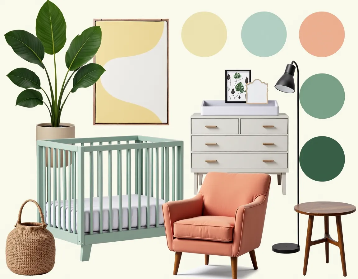
A baby room mood board should include more than inspiration photos. At minimum, it should cover six decision areas: palette, anchor furniture, storage, textiles, lighting, and wall treatment. The palette keeps the room emotionally consistent. The anchor furniture, especially the crib and chair, gives the room structure. Storage determines whether the nursery stays calm after week one. Textiles soften the room. Lighting affects both mood and function. Wall treatment tells you how much visual pattern the room can handle.
We usually recommend building the board in layers. Start with one full-room inspiration image, then add a crib reference, a chair or glider, a rug, one storage piece, and two or three close-up material references. That approach is much more useful than dumping twenty screenshots into one file and hoping a pattern appears. If you want more help thinking through palette logic, interior design color palette guide is the most useful supporting read inside the MBA blog.
The other important inclusion is a reality check. Add one item you already own or know you will buy, whether that is a hand-me-down dresser, a specific crib finish, or a wallpaper sample. Once one real-world constraint enters the board, the rest of the design becomes more grounded and easier to trust.
Which Nursery Color Palettes Work Best in 2026?
The best nursery decor ideas 2026 are softer, warmer, and more layered than the high-contrast theme rooms that dominated social feeds a few years ago. The strongest nursery color palettes right now use one calming green or neutral, then add a peach, butter yellow, dusty rose, muted lavender, or soft blue accent. The room still needs personality, but the goal is to feel restorative rather than overstimulating.
Sage with cream and pale wood is probably the easiest long-term win. It feels current in 2026, works for multiple ages, and looks good in daylight and low evening lamp light. Mint with peach and pale yellow is another strong direction because it feels cheerful without becoming sugary. Lavender with pink and light grey works well when you want the room to feel softer and slightly more polished. Parents who like bolder contrast can use forest green with dusty rose, but it works best when the rest of the room is kept simple.
If you are choosing between a few color families, build quick variations in MoodBoardAI's AI generator and compare them side by side. Then move the winner into the mood board editor so you can swap in actual products. That sequence is much faster than repainting after the fact.

How Do You Pick Textures That Make a Nursery Feel Calm?
Texture matters in nurseries more than most people expect. When the palette is soft, texture is what keeps the room from feeling washed out. Boucle, washed cotton, quilted bedding, wool rugs, linen curtains, cane details, matte wood, and lightly brushed metals all bring depth without shouting for attention. A nursery that uses only color and no texture usually ends up looking flatter than it felt in your head.
The board should show contrast in softness, not just contrast in hue. For example, a pale mint wall next to a smooth white crib can feel too sterile until you add a nubby rug, cotton curtain, upholstered glider, and wood storage basket. That is why we like mood boards for nursery design planning: they reveal whether the room is emotionally warm enough before the products arrive.
This is also where over-theming tends to show up. If every element tries to signal the same motif, whether that is woodland, celestial, or coastal, the texture story gets lost under repetition. A better nursery decor idea is to use one pattern or motif in a quiet way and let materials do the heavy lifting.

How Much Theme Is Too Much for a Nursery?
A mood board is the fastest way to answer this, because it makes visual repetition obvious. If the wallpaper has stars, the bedding has stars, the mobile has stars, the art has stars, and the storage bins have stars, the room stops feeling calm and starts feeling like a merchandise set. The same problem happens with safari, rainbow, woodland, and cloud themes.
The best nursery mood board ideas use theme as seasoning, not structure. Let the room be primarily about color, shape, and comfort. Then add one or two details that suggest the story. A woodland nursery might use sage walls, oak furniture, a wool rug, and one set of animal prints. A coastal nursery might use sand, pale blue, coral, and woven textures without literal anchors on every surface. If you want more examples of how mood boards keep style cohesive without becoming costume, mood board creation with AI is a helpful companion read.
That approach ages better too. The nursery should be able to become a toddler room later without starting over from zero.
What Mistakes Show Up Most Often in Nursery Design Planning?
The most common mistake is choosing items in isolation. The second is underestimating storage. The third is focusing on the crib photo and ignoring the chair, lighting, and blackout setup that make the room workable in real life. We have seen plenty of boards that look sweet until a diaper caddy, sound machine, hamper, and toy storage need to exist somewhere.
Another frequent mistake is pushing the palette too pale without enough contrast. Very soft rooms can be beautiful, but they still need grounding through wood tone, one darker line, or a stronger textile. Otherwise the nursery looks unfinished. The opposite mistake is adding too many cute accents, which turns the room noisy. If your board feels busy, remove half the decor before you remove the furniture.
A final mistake is treating mood boards as just inspiration. The board should become a decision tool. That means labeling what is fixed, what is flexible, and what can wait. Once you do that, the board stops being aspirational and starts being useful.
How Can MoodBoardAI Speed Up Nursery Planning?
The biggest advantage is momentum. Parents are rarely lacking ideas; they are lacking a clean way to compare them. With MoodBoardAI's AI generator, you can test multiple nursery directions in under 30 seconds, then see which one actually matches the feeling you want. Once you have a direction, the mood board editor helps you replace generic inspiration with exact crib finishes, fabric references, paint swatches, and decor decisions.
That is especially useful when you are deciding between two good options instead of one obvious winner. Maybe you like mint and peach, but you also like sage and cream. Maybe one partner wants a more playful room and the other wants something calmer. A side-by-side board resolves those debates faster than words do.
If you are planning other spaces in the home at the same time, living room mood board guide and home office mood board ideas are useful examples of how the same visual process works across completely different rooms. The principle is the same: compare first, buy second.
Which Nursery Mood Board Direction Fits Your Home Best?
If the rest of your home is calm and warm, a sage, cream, and pale oak nursery will probably feel the most integrated. If you want a little more softness and sweetness, mint, peach, and butter yellow gives you warmth without visual sugar rush. If you want a slightly dressier room, lavender, soft pink, and light grey can look beautiful, especially with brass or a floral fixture. If you want stronger contrast, forest green and dusty rose works, but it needs editing discipline.
The best nursery mood board is not the cutest one. It is the one that still makes sense after you add baskets, wipes, nursing essentials, extra blankets, and a human being who will actually use the room every day. That is why parents who plan visually tend to waste less money and end up with calmer spaces. Build the board, compare the options, then buy with confidence.
How Do Popular Nursery Mood Board Ideas Compare in 2026?
Use this table to narrow down the direction before you start sourcing products.
| Nursery direction | Best colors | Why it works | Watch-out |
|---|---|---|---|
| Soft sage calm | Sage, cream, pale oak, warm white | Timeless, flexible, easy to age up | Needs texture so it does not feel flat |
| Mint and peach glow | Mint green, peach, light yellow | Cheerful, light, and friendly for 2026 | Can feel too pastel without a grounding wood tone |
| Lavender and blush | Lavender, soft pink, light grey, brass | Gentle and polished with a slightly dressier mood | Can read too sweet if patterns are overused |
| Forest and rose contrast | Forest green, dusty rose, cream, walnut | Rich, memorable, more design-forward | Needs restraint so it stays restful |
| Warm neutral minimal | Oat, beige, peach, natural wood | Simple, adaptable, easy to shop | Can look bland if there is no texture contrast |
What Questions Do Parents Still Ask About Nursery Mood Boards?
What should a nursery mood board include?
A nursery mood board should include your color palette, crib style, chair or glider, storage, rug, lighting, wall treatment, and a few texture references. The point is to see the full room direction before individual purchases start pulling the nursery in different directions. One full-room image plus several close-up material and furniture references usually works better than a giant pile of unrelated inspiration screenshots.
How many colors should be in a nursery color palette?
Three to five colors is usually enough. A good nursery color palette has one dominant base, one supporting color, one accent, and then material tones like wood or metal. More than that and the room starts feeling visually busy, especially once books, toys, and baby gear enter the space. The mood board should help you keep those relationships clear.
When should parents make a baby room mood board?
Before buying furniture or paint. A baby room mood board is most useful during planning, because it helps you decide what deserves budget and what should stay simple. Once large purchases are already made, the board can still help, but you lose a lot of flexibility. It is much easier to move digital images around than return a dresser that does not belong.
Can an AI mood board tool help with nursery design planning?
Yes. An AI tool is useful because it gives you a fast draft to react to. Instead of staring at a blank board, you can compare a few nursery directions, then refine the strongest one with real products, paint colors, and storage choices. That speed is especially useful for couples making shared decisions because it turns vague preferences into something visible.
What nursery colors feel timeless in 2026?
Soft sage, warm cream, dusty peach, buttery yellow, muted lavender, and natural wood tones all feel current in 2026 without being locked to one fleeting trend. They work because they are calm and flexible. You can update the room later with new textiles, art, or toys without the whole palette collapsing.
How do you make a nursery feel coordinated but not over-themed?
Keep the palette and materials consistent, then limit the literal theme cues. A room usually feels better when the “story” appears through one wallpaper, a few prints, or one mobile instead of repeating on every object. Mood boards make this easy to spot. If the room looks like the same motif is appearing everywhere, pull it back and let the textures do more of the design work.