How to Create a Mood Board for Interior Design
Most people start decorating from the wrong end. They fall in love with a chair in a furniture store, buy it, bring it home, and then spend the next several months trying to build a room around it that sort of works. Sometimes it does. More often, something feels slightly off, and they can never quite identify why.
A mood board is the antidote to that. It's the thing you make before buying anything, so every later decision has a framework to measure itself against.
Key Takeaways:
- Build your mood board before buying anything, including paint.
- Start with your anchor piece, the most permanent or expensive element, instead of a color palette.
- A useful mood board has three layers: anchor, palette, then accents and textures.
- Edit ruthlessly. A tight board of 12 elements beats a sprawling collection of 60.
- Digital tools like MoodBoardAI let you test palettes against real rooms before you commit.
Why a mood board isn't just a Pinterest board
There is a difference between collecting inspiration and making decisions. Pinterest is the former: an infinite scroll of beautiful rooms that may or may not have anything to do with each other. A mood board is the latter.
The goal of an interior design mood board is to commit to a direction. You're not collecting possibilities. You're narrowing down to one clear vision. When the board is finished, it should answer what the style is, what the colors are, which materials and textures belong, and what emotional atmosphere the room should have.
This distinction matters because the board is supposed to guide every later purchase. Does that lamp work? Check the board. Does the rug belong? Check the board. A clear reference prevents the slow accumulation of individually nice objects that never quite cohere into a room.
Start with your anchor piece, not your palette
This is the most common process mistake: building a color palette first and then trying to find furniture that fits it. It works in theory but almost never in practice, because the swatches you loved in isolation often look completely different once furniture scale, fabric texture, and your room's natural light enter the picture.
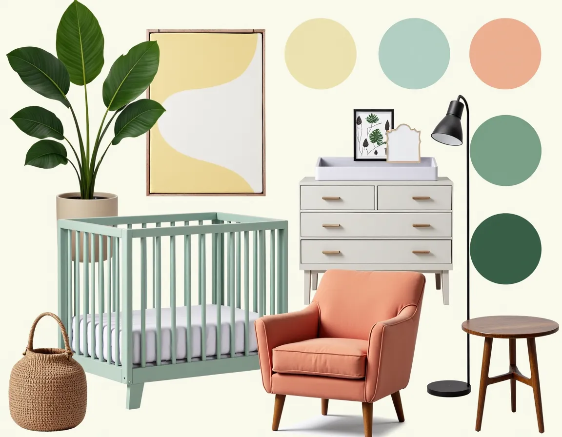
The anchor piece is the most permanent or most expensive element in your space. Usually this is a sofa, a bed, a rug, or existing flooring that you're keeping. If you're starting from scratch, it is whichever piece you feel most strongly about, the one you would be most disappointed to change later.
Once you have the anchor, you are not choosing colors from infinity anymore. You are matching them. If your anchor is a warm walnut floor, your palette should build on that warmth with tones like golden ochre, warm cream, or terracotta. If your anchor is a deep navy sofa, that becomes the constraint the rest of the palette has to support.
The three-layer structure that makes a room cohesive
Every well-designed room can be understood as three layers stacked on top of each other. If you understand these layers before you build your board, you will know what the board needs to represent.
Layer one is the base: your dominant color and your largest surfaces. Walls, flooring, and the biggest furniture pieces usually live here. This covers about 60 percent of the room's visual field.
Layer two is the secondary palette: the midtones and complementary colors that make the base feel intentional rather than flat. This is where rugs, window treatments, and secondary textiles usually sit. Together they account for about 30 percent of the room's color story.
Layer three is accents and textures: the final 10 percent that gives the room personality. Throw pillows, art, ceramics, plants, and smaller furniture pieces belong here. They should be the last thing you decide, not the first.
When you're building your board, make sure you have at least one strong reference for each layer. A board full of accent inspiration and no foundational references will produce a room with nice details and no backbone.
How to edit: the most important mood boarding skill
Most people stop at collecting. They find images they love, add them to a board, and call it finished. The real work is editing.
After collecting 40 to 50 images, remove everything that does not fit the majority. If the board is mostly warm, natural, textured rooms and a handful of sleek minimalist spaces are interrupting it, those minimalist spaces do not belong, even if you like them individually.
Keep editing until the board has roughly 12 to 20 elements and every one of them reads like part of the same story. Colors should feel related. Materials should feel compatible. The emotional tone, whether calm, cozy, vibrant, or moody, should be consistent.
A tight, edited mood board can feel slightly uncomfortable because it means committing to one direction instead of keeping options open. That discomfort is the point. Committing to a direction is the actual function of a mood board.
For your interior design mood board, this is where a digital tool becomes genuinely useful. You can test whether a palette works in a room context instead of judging it from swatches alone.
What most people get wrong and how to avoid it
The most common mistake is mixing multiple styles without realizing it. You may love the clean lines of Scandinavian design and the warmth of Bohemian texture, but combining them without a clear hierarchy often produces a room that feels muddled.
The fix is to pick one style as primary and let the others inform it through accents. If the room is Scandinavian-primary, then the logic stays clean, structured, and light, while woven rugs or layered textiles can bring in Bohemian warmth without taking over.
The second mistake is ignoring light conditions. A color that looks warm and honey-toned in a south-facing room can feel flat in a north-facing one. When you build your board, use room examples that resemble the actual light quality of your space.
The third mistake is making the board aspirational instead of functional. Beautiful rooms that ignore your budget, your actual floor plan, or what you already own can be useful inspiration, but they are not a working mood board.
Textures are colors too
One of the things that separates a sophisticated mood board from a flat one is the inclusion of texture references. Textures behave like colors in terms of visual weight, and ignoring them means the board only tells half the story.
A rough linen sofa and a smooth velvet sofa in the same grey produce entirely different rooms. Linen reads casual and relaxed. Velvet reads formal and reflective. Same color, different atmosphere. Your board should show that distinction either through close-up materials or through room images where the texture is obvious.
For 2026 interiors especially, where the earth tone palette trend is driven as much by material story as by color, texture is non-negotiable. A terracotta wall gets richer next to chunky knits and raw linen. An espresso sofa feels deeper beside a textured natural cushion.
From board to room: using what you've built
Once the board is finished and edited, use it actively as a decision filter. For every purchase you consider, hold it against the board and ask whether it belongs.
This requires discipline. The chair may be beautiful, but if it is not on the board, it may not belong. The lamp may be interesting, but if it pulls in another direction, it weakens the room rather than improving it. The board exists to protect you from impulse decisions that dilute the room's coherence.
When you bring the palette into MoodBoardAI and see it applied to actual room layouts, some details will shift. That's normal. A color that looks perfect on the board may need a slight adjustment once it is rendered in room proportions. Let those changes stay small. If everything changes, you probably need another editing pass.
The mood board is not really finished when you build it. It is finished when the room is. Along the way, it is the most useful tool you have for keeping every decision coherent.
Frequently asked questions
What should I include in an interior design mood board?
A complete mood board should include a 3 to 5 color palette, texture samples such as fabric, wood, or stone, your anchor piece or main furniture silhouette, lighting direction, flooring or rug references, and a few room examples that capture the feeling you're after.
How many colors should be in an interior design mood board?
Three to five colors is the sweet spot: one dominant color, one secondary color, and one or two accent colors. If you go well beyond that, you are probably still collecting inspiration rather than making decisions.
Should I create my mood board before or after buying furniture?
Before. The whole point is to make decisions in a zero-risk environment before you spend money. If you already own pieces you are keeping, add them as the anchor and build the rest around them.
What's the best digital tool for creating interior design mood boards?
The best tool is the one you will actually use. MoodBoardAI is useful because it lets you see how palettes behave in real room contexts rather than only as color swatches.
How do I know when my mood board is finished?
Your board is finished when every element belongs to the same visual story and you have removed everything that does not. A finished board makes one clear statement instead of presenting multiple competing directions.